
In this portfolio project I will be looking at data from the stock market, particularly some technology stocks. I will use pandas to get stock information, visualize different aspects of it, and finally I will look at a few ways of analyzing the risk of a stock, based on its previous performance history. I will also be predicting future stock prices through a Monte Carlo method!
I’ll be answering the following questions along the way:
1.) What was the change in price of the stock over time?
2.) What was the daily return of the stock on average?
3.) What was the moving average of the various stocks?
4.) What was the correlation between different stocks’ closing prices?
5.) What was the correlation between different stocks’ daily returns?
6.) How much value do we put at risk by investing in a particular stock?
7.) How can we attempt to predict future stock behavior?
Basic Analysis of Stock Information
In this section I’ll go over how to handle requesting stock information with pandas, and how to analyze basic attributes of a stock.
In [120]:
# Let's go ahead and start with some imports
import pandas as pd
from pandas import Series,DataFrame
import numpy as np

# For Visualization
import matplotlib.pyplot as plt
import seaborn as sns
sns.set_style('whitegrid')
%matplotlib inline

# For reading stock data from yahoo
from pandas_datareader import DataReader

# For time stamps
from datetime import datetime

# For division
exec('from __future__ import division')
I modified the division code to prevent a syntax error from ‘from future import division’ to prevent syntax error)was Let’s use Yahoo and pandas to grab some data for some tech stocks.
In [121]:
# The tech stocks we'll use for this analysis
tech_list = ['AAPL','GOOG','MSFT','AMZN']

# Set up End and Start times for data grab
end = datetime.now()
start = datetime(end.year-1,end.month,end.day)

# For loop for grabing yahoo finance data and setting as a dataframe

for stock in tech_list:
    globals()[stock] = DataReader(stock,'yahoo',start,end)
Quick note: Using globals() is a sloppy way of setting the DataFrame names, but its simple
Let’s go ahead and play aorund with the AAPL DataFrame to get a feel for the data
In [122]:
# Summary Stats
AAPL.describe()
Out [122]:
| High | Low | Open | Close | Volume | Adj Close | |
|---|---|---|---|---|---|---|
| count | 251.000000 | 251.000000 | 251.000000 | 251.000000 | 2.510000e+02 | 251.000000 |
| mean | 194.908925 | 190.980956 | 192.893028 | 193.002749 | 3.255789e+07 | 191.748566 |
| std | 21.927123 | 21.765480 | 21.809329 | 21.826569 | 1.388063e+07 | 21.423601 |
| min | 145.720001 | 142.000000 | 143.979996 | 142.190002 | 1.136200e+07 | 141.039642 |
| 25% | 175.934998 | 173.555000 | 174.805000 | 174.794998 | 2.303000e+07 | 174.024834 |
| 50% | 198.850006 | 193.789993 | 196.419998 | 195.690002 | 2.966390e+07 | 195.570007 |
| 75% | 210.339996 | 207.184998 | 209.315002 | 208.975006 | 3.876575e+07 | 207.710114 |
| max | 233.470001 | 229.779999 | 230.779999 | 232.070007 | 9.624670e+07 | 229.392090 |
In [123]:
# General Info
AAPL.info()
<class 'pandas.core.frame.DataFrame'>
DatetimeIndex: 251 entries, 2018-07-30 to 2019-07-29
Data columns (total 6 columns):
High         251 non-null float64
Low          251 non-null float64
Open         251 non-null float64
Close        251 non-null float64
Volume       251 non-null float64
Adj Close    251 non-null float64
dtypes: float64(6)
memory usage: 13.7 KB
In [124]:
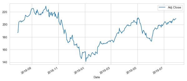
# Let's see a historical view of the closing price
AAPL['Adj Close'].plot(legend=True,figsize=(10,4))
Out [124]:
<matplotlib.axes._subplots.AxesSubplot at 0x286165d7390>
In [125]:
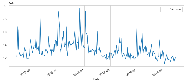
# Now let's plot the total volume of stock being traded each day over the past 5 years
AAPL['Volume'].plot(legend=True,figsize=(10,4))
Out [125]:
<matplotlib.axes._subplots.AxesSubplot at 0x286199ef7f0>
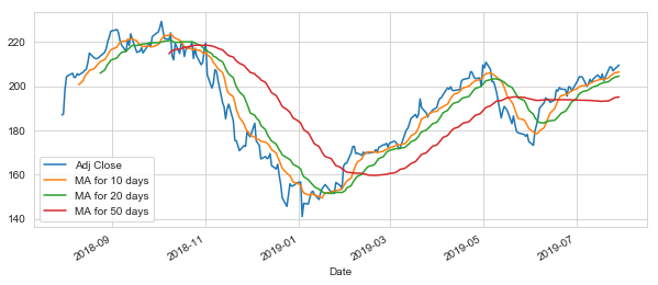
Now that we’ve seen the visualizations for the closing price and the volume traded each day, let’s go ahead and caculate the moving average for the stock.
For more info on the moving average check out the following links:
1.) http://www.investopedia.com/terms/m/movingaverage.asp
2.) http://www.investopedia.com/articles/active-trading/052014/how-use-moving-average-buy-stocks.asp
In [126]:
# Luckily pandas has a built-in rolling mean calculator

# Let's go ahead and plot out several moving averages
ma_day = [10,20,50]

for ma in ma_day:

    column_name = "MA for %s days" %(str(ma))

    AAPL[column_name] = AAPL['Adj Close'].rolling(window=ma).mean()
Now let’s go ahead and plot all the additional Moving Averages
In [127]:
AAPL[['Adj Close','MA for 10 days','MA for 20 days','MA for 50 days']].plot(subplots=False,figsize=(10,4))
Out [127]:
<matplotlib.axes._subplots.AxesSubplot at 0x28619c8e978>
Section 2 – Daily Return Analysis
Now that I’ve done some baseline analysis, I’ll go ahead and dive a little deeper. I’m now going to analyze the risk of the stock. In order to do so we’ll need to take a closer look at the daily changes of the stock, and not just its absolute value. Let’s go ahead and use pandas to retrieve teh daily returns for the Apple stock.
In [128]:
# We'll use pct_change to find the percent change for each day
AAPL['Daily Return'] = AAPL['Adj Close'].pct_change()

# Then we'll plot the daily return percentage
AAPL['Daily Return'].plot(figsize=(10,4),legend=True,linestyle='--',marker='o')
Out [128]:
<matplotlib.axes._subplots.AxesSubplot at 0x28619a14278>
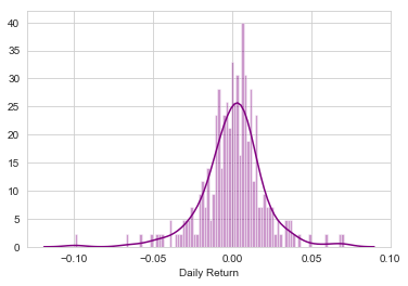
Great, now let’s get an overall look at the average daily return using a histogram. We’ll use seaborn to create both a histogram and kde plot on the same figure.
In [129]:
# Note the use of dropna() here, otherwise the NaN values can't be read by seaborn
sns.distplot(AAPL['Daily Return'].dropna(),bins=100, color = 'purple')
Out [129]:
<matplotlib.axes._subplots.AxesSubplot at 0x2861c588240>
In [130]:
# AAPL['Daily Return'].hist()
AAPL['Daily Return'].hist(bins=100)
Out [130]:
<matplotlib.axes._subplots.AxesSubplot at 0x286165d72b0>
So, what if I wanted to analyze the returns of all the stocks in our list? Time to build a DataFrame with all the [‘Close’] columns for each of the stocks dataframes.
In [131]:
# Grab all the closing prices for the tech stock list into one DataFrame
closing_df = DataReader(tech_list,'yahoo',start,end)['Adj Close']
In [132]:
# Let's take a quick look
closing_df.head()
Out [132]:
| Symbols | AAPL | AMZN | GOOG | MSFT |
|---|---|---|---|---|
| Date | ||||
| 2018-07-30 | 187.062546 | 1779.219971 | 1219.739990 | 103.686295 |
| 2018-07-31 | 187.436829 | 1777.439941 | 1217.260010 | 104.384949 |
| 2018-08-01 | 198.478760 | 1797.170044 | 1220.010010 | 104.581749 |
| 2018-08-02 | 204.280457 | 1834.329956 | 1226.150024 | 105.851128 |
| 2018-08-03 | 204.871445 | 1823.290039 | 1223.709961 | 106.313622 |
Now that I have all the closing prices, I’ll go ahead and get the daily return for all the stocks, like I did for the Apple stock.
In [133]:
# Make a new tech returns DataFrame
tech_rets = closing_df.pct_change()
In [134]:
# Let's take a quick look
tech_rets.head()
Out [134]:
| Symbols | AAPL | AMZN | GOOG | MSFT |
|---|---|---|---|---|
| Date | ||||
| 2018-07-30 | NaN | NaN | NaN | NaN |
| 2018-07-31 | 0.002001 | -0.001000 | -0.002033 | 0.006738 |
| 2018-08-01 | 0.058910 | 0.011100 | 0.002259 | 0.001885 |
| 2018-08-02 | 0.029231 | 0.020677 | 0.005033 | 0.012138 |
| 2018-08-03 | 0.002893 | -0.006019 | -0.001990 | 0.004369 |
In [135]:
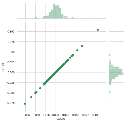
# Comparing Google to itself should show a perfectly linear relationship
sns.jointplot('GOOG','GOOG',tech_rets,kind = 'scatter', color='seagreen')
Out [135]:
<seaborn.axisgrid.JointGrid at 0x2861b278390>
In [136]:
# We'll use joinplot to compare the daily returns of Google and Microsoft
sns.jointplot('GOOG','MSFT',tech_rets,kind='scatter')
Out [136]:
<seaborn.axisgrid.JointGrid at 0x2861b2c68d0>
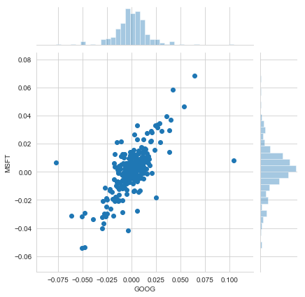
Intersting, the pearsonr value (officially known as the Pearson product-moment correlation coefficient) can give you a sense of how correlated the daily percentage returns are. Seaborn and pandas make it very easy to repeat this comparison analysis for every possible combination of stocks in our technology stock ticker list. We can use sns.pairplot() to automatically create this plot
In [137]:
tech_rets.head()
Out [137]:
| Symbols | AAPL | AMZN | GOOG | MSFT |
|---|---|---|---|---|
| Date | ||||
| 2018-07-30 | NaN | NaN | NaN | NaN |
| 2018-07-31 | 0.002001 | -0.001000 | -0.002033 | 0.006738 |
| 2018-08-01 | 0.058910 | 0.011100 | 0.002259 | 0.001885 |
| 2018-08-02 | 0.029231 | 0.020677 | 0.005033 | 0.012138 |
| 2018-08-03 | 0.002893 | -0.006019 | -0.001990 | 0.004369 |
In [138]:
# We can simply call pairplot on our DataFrame for an automatic visual analysis of all the comparisons
sns.pairplot(tech_rets.dropna())
Out [138]:
<seaborn.axisgrid.PairGrid at 0x2861c9db860>
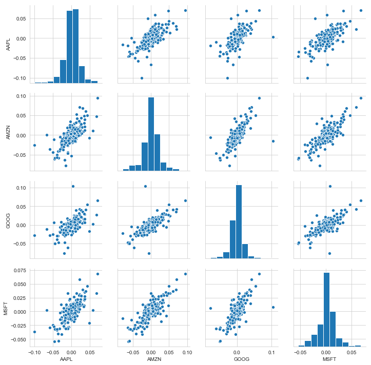
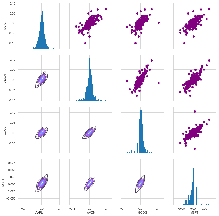
Above we can see all the relationships on daily returns between all the stocks. A quick glance shows an interesting correlation between Google and Amazon daily returns. It might be interesting to investigate that individual comaprison. While the simplicity of just calling sns.pairplot() is fantastic we can also use sns.PairGrid() for full control of the figure, including what kind of plots go in the diagonal, the upper triangle, and the lower triangle. Below is an example of utilizing the full power of seaborn to achieve this result.
In [139]:
# Set up our figure by naming it returns_fig, call PairPLot on the DataFrame
returns_fig = sns.PairGrid(tech_rets.dropna())

# Using map_upper we can specify what the upper triangle will look like.
returns_fig.map_upper(plt.scatter,color='purple')

# We can also define the lower triangle in the figure, inclufing the plot type (kde) or the color map (BluePurple)
returns_fig.map_lower(sns.kdeplot,cmap='cool_d')

# Finally we'll define the diagonal as a series of histogram plots of the daily return
returns_fig.map_diag(plt.hist,bins=30)
Out [139]:
<seaborn.axisgrid.PairGrid at 0x2861e33be10>
We could have also analyzed the correlation of the closing prices using this exact same technique. Here it is shown, the code repeated from above with the exception of the DataFrame called.
In [140]:
returns_fig = sns.PairGrid(closing_df)

returns_fig.map_upper(plt.scatter,color='purple')

returns_fig.map_lower(sns.kdeplot,cmap='cool_d')

returns_fig.map_diag(plt.hist,bins=30)
Out [140]:
<seaborn.axisgrid.PairGrid at 0x2861e02a748>
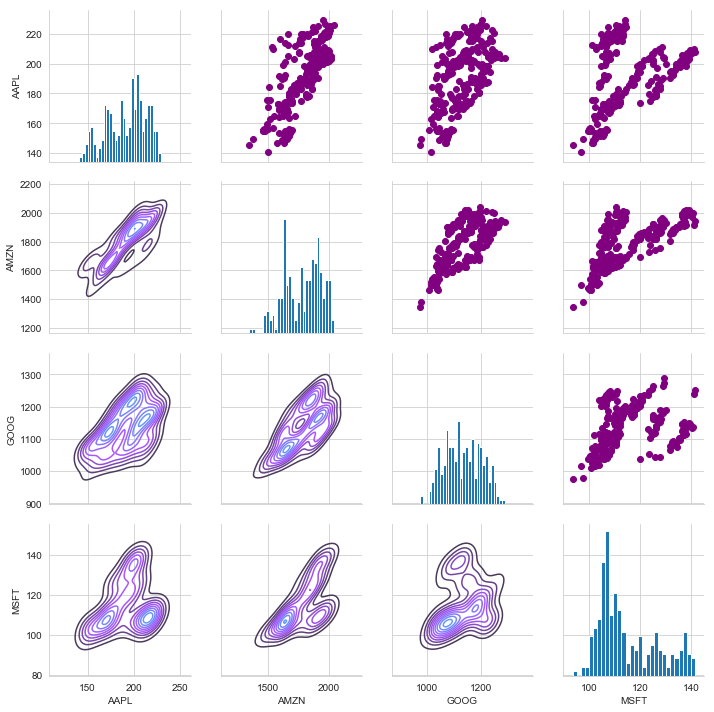
Finally, we could also do a correlation plot, to get actual numerical values for the correlation between the stocks’ daily return values. By comparing the closing prices, we see an interesting relationship between Microsoft and Apple.
In [141]:
import numpy as np; np.random.seed(1)
import pandas as pd
import matplotlib.pyplot as plt

# Seborn apionly module from the Seaborn package. This is now deprecated (since July 2017). T
plt.style.use("classic")

# Generate a random dataset
cols = [s*4 for s in list("ABCD")]
df = pd.DataFrame(data=np.random.rayleigh(scale=5, size=(100, 4)), columns=cols)

# Compute the correlation matrix
corr = tech_rets.dropna().corr()
print(corr)

# Generate a mask for the upper triangle
mask = np.zeros_like(corr, dtype=np.bool)
mask[np.triu_indices_from(mask)] = True

# Set up the matplotlib figure
fig, ax = plt.subplots()

# Draw the heatmap with the mask and correct aspect ratio
vmax = np.abs(corr.values[~mask]).max()
sns.heatmap(corr, mask=mask, cmap=plt.cm.PuOr, vmin=-vmax, vmax=vmax,
            square=True, linecolor="lightgray", linewidths=1, ax=ax)

for i in range(len(corr)):
    ax.text(i+0.5,(i+0.5), corr.columns[i], ha="center", va="center", rotation=45)
    for j in range(i+1, len(corr)):
        s = "{:.3f}".format(corr.values[i,j])
        ax.text(j+0.5,(i+0.5),s,
            ha="center", va="center")
ax.axis("off")
plt.show()
Symbols      AAPL      AMZN      GOOG      MSFT
Symbols
AAPL     1.000000  0.691181  0.606114  0.689839
AMZN     0.691181  1.000000  0.721185  0.798654
GOOG     0.606114  0.721185  1.000000  0.701224
MSFT     0.689839  0.798654  0.701224  1.000000
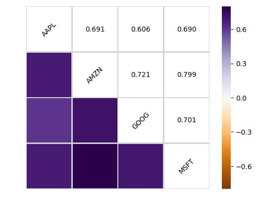
Fantastic! Just like we suspected in our PairPlot we see here numerically and visually that Amazon and Google had the strongest correlation of daily stock return. It’s also interesting to see that all the technology comapnies are positively correlated.
Great! Now that we’ve done some daily return analysis, let’s go ahead and start looking deeper into actual risk analysis.
Risk Analysis
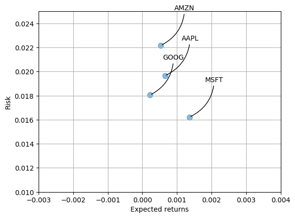
There are many ways we can quantify risk, one of the most basic ways using the information we’ve gathered on daily percentage returns is by comparing the expected return with the standard deviation of the daily returns.
In [142]:
import matplotlib as mpl
mpl.rcParams.update(mpl.rcParamsDefault)

# Let's start by defining a new DataFrame as a clenaed version of the oriignal tech_rets DataFrame
rets = tech_rets.dropna()
area = np.pi*20
plt.scatter(rets.mean(), rets.std(), alpha = 0.5,s =area)

# Set gridlines
plt.grid(True)

# Set the x and y limits of the plot (optional, remove this if you don't see anything in your plot)
plt.ylim([0.01,0.025])
plt.xlim([-0.003,0.004])

#Set the plot axis titles
plt.xlabel('Expected returns')
plt.ylabel('Risk')

# Label the scatter plots
for label, x, y in zip(rets.columns, rets.mean(), rets.std()):
    plt.annotate(
        label,
        xy = (x, y), xytext = (50, 50),
        textcoords = 'offset points', ha = 'right', va = 'bottom',
        arrowprops = dict(arrowstyle = '-', connectionstyle = 'arc3,rad=-0.3'))
Value at Risk
Let’s go ahead and define a value at risk parameter for our stocks. We can treat value at risk as the amount of money we could expect to lose (aka putting at risk) for a given confidence interval. Theres several methods we can use for estimating a value at risk. Let’s go ahead and see some of them in action.
Value at risk using the “bootstrap” method
For this method we will calculate the empirical quantiles from a histogram of daily returns.
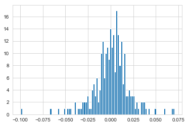
Let’s go ahead and repeat the daily returns histogram for Apple stock.
In [143]:
sns.distplot(AAPL['Daily Return'].dropna(),bins=100,color='purple')
plt.grid()
plt.show()
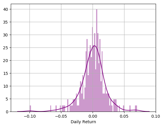
Now we can use quantile to get the risk value for the stock.
In [144]:
# The 0.05 empirical quantile of daily returns
rets['AAPL'].quantile(0.05)
Out [144]:
-0.0312346728634737
The 0.05 empirical quantile of daily returns is at -0.019. That means that with 95% confidence, our worst daily loss will not exceed 1.9%. If we have a 1 million dollar investment, our one-day 5% VaR is 0.019 * 1,000,000 = $19,000.
I will repeat this for the other stocks in out portfolio, then afterwards we’ll look at value at risk by implementing a Monte Carlo method.
Value at Risk using the Monte Carlo method Using the Monte Carlo to run many trials with random market conditions, then we’ll calculate portfolio losses for each trial. After this, we’ll use the aggregation of all these simulations to establish how risky the stock is.
I’ll start with a brief explanation of my plan of action:
We will use the geometric Brownian motion (GBM), which is technically known as a Markov process. This means that the stock price follows a random walk and is consistent with (at the very least) the weak form of the efficient market hypothesis (EMH): past price information is already incorporated and the next price movement is “conditionally independent” of past price movements.
This means that the past information on the price of a stock is independent of where the stock price will be in the future, basically meaning, you can’t perfectly predict the future solely based on the previous price of a stock.
The equation for geometric Browninan motion is given by the following equation:
![]()
Where S is the stock price, mu is the expected return (which we calculated earlier),sigma is the standard deviation of the returns, t is time, and epsilon is the random variable.
We can mulitply both sides by the stock price (S) to rearrange the formula and solve for the stock price.
![]()
Now we see that the change in the stock price is the current stock price multiplied by two terms. The first term is known as “drift”, which is the average daily return multiplied by the change of time. The second term is known as “shock”, for each time period the stock will “drift” and then experience a “shock” which will randomly push the stock price up or down. By simulating this series of steps of drift and shock thousands of times, we can begin to do a simulation of where we might expect the stock price to be.
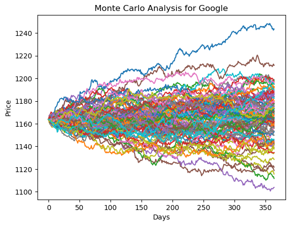
To demonstrate a basic Monte Carlo method, we will start with just a few simulations. First we’ll define the variables we’ll be using the Google DataFrame ‘GOOG’.
In [145]:
rets.head()
Out [145]:
| Symbols | AAPL | AMZN | GOOG | MSFT |
|---|---|---|---|---|
| Date | ||||
| 2018-07-31 | 0.002001 | -0.001000 | -0.002033 | 0.006738 |
| 2018-08-01 | 0.058910 | 0.011100 | 0.002259 | 0.001885 |
| 2018-08-02 | 0.029231 | 0.020677 | 0.005033 | 0.012138 |
| 2018-08-03 | 0.002893 | -0.006019 | -0.001990 | 0.004369 |
| 2018-08-06 | 0.005193 | 0.013415 | 0.000866 | 0.000833 |
In [146]:
rets['AAPL'].quantile(0.05)
Out [146]:
-0.0312346728634737
In [147]:
# Set up our time horizon
days = 365

# Now our delta
dt = 1/days

# Now let's grab our mu (drift) from the expected return data we got for AAPL
mu= rets.mean()['GOOG']

# Now let's grab the volatility of the stock from the std() of the average return
sigma = rets.std()['GOOG']
In [148]:
#This function takes in starting stock price, days of simulation, mu, sigma, and returns simulated price array
def stock_monte_carlo(start_price,days,mu,sigma):

    # Define a price array
    price = np.zeros(days)
    price[0] = start_price

    # Schok and Drift
    shock = np.zeros(days)
    drift = np.zeros(days)

    # Run price array for number of days
    for x in range(1,days):

        # Calculate Schock
        shock[x] = np.random.normal(loc=mu*dt,scale= sigma*np.sqrt(dt))

        # Calculate Drift
        drift[x] = mu * dt

        # Calculate Price
        price[x] = price[x-1] + (price[x-1] * (drift[x] + shock[x]))

    return price
Nice! Now I will put our function to work!
In [149]:
GOOG.head()
Out [149]:
| High | Low | Open | Close | Volume | Adj Close | |
|---|---|---|---|---|---|---|
| Date | ||||||
| 2018-07-30 | 1234.916016 | 1211.469971 | 1228.010010 | 1219.739990 | 1849900 | 1219.739990 |
| 2018-07-31 | 1227.588013 | 1205.599976 | 1220.010010 | 1217.260010 | 1644700 | 1217.260010 |
| 2018-08-01 | 1233.469971 | 1210.209961 | 1228.000000 | 1220.010010 | 1567200 | 1220.010010 |
| 2018-08-02 | 1229.880005 | 1204.790039 | 1205.900024 | 1226.150024 | 1531300 | 1226.150024 |
| 2018-08-03 | 1230.000000 | 1215.060059 | 1229.619995 | 1223.709961 | 1089600 | 1223.709961 |
In [150]:
# Get start price from GOOG.head()
start_price = 1163.849976

for run in range(100):
    plt.plot(stock_monte_carlo(start_price,days,mu,sigma))

plt.xlabel('Days')
plt.ylabel('Price')
plt.title('Monte Carlo Analysis for Google')
Out [150]:
Text(0.5, 1.0, 'Monte Carlo Analysis for Google')
Let’s go ahead and get a histogram of the end results for a much larger run. (note: This could take a little while to run , depending on the number of runs chosen).
In [151]:
# Set a large numebr of runs
runs = 10000

# Create an empty matrix to hold the end price data
simulations = np.zeros(runs)

# Set the print options of numpy to only display 0-5 points from an array to suppress output
np.set_printoptions(threshold=5)

for run in range(runs):
    simulations[run] = stock_monte_carlo(start_price,days,mu,sigma)[days-1]
Now that we have our array of simulations, we can go ahead and plot a histogram ,as well as use qunatile to define our risk for this stock.
In [152]:
# Now we'lll define q as the 1% empirical qunatile, this basically means that 99% of the values should fall between here
q = np.percentile(simulations, 1)

# Now let's plot the distribution of the end prices
plt.hist(simulations,bins=200)

# Using plt.figtext to fill in some additional information onto the plot

# Starting Price
plt.figtext(0.6, 0.8, s="Start price: $%.2f" %start_price)
# Mean ending price
plt.figtext(0.6, 0.7, "Mean final price: $%.2f" % simulations.mean())

# Variance of the price (within 99% confidence interval)
plt.figtext(0.6, 0.6, "VaR(0.99): $%.2f" % (start_price - q,))

# Display 1% quantile
plt.figtext(0.15, 0.6, "q(0.99): $%.2f" % q)

# Plot a line at the 1% quantile result
plt.axvline(x=q, linewidth=4, color='r')

# Title
plt.title(u"Final price distribution for Google Stock after %s days" % days, weight='bold');
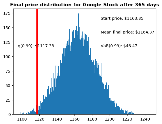
Awesome! Now we have looked at the 1% empirical quantile of the final price distribution to estimate the Value at Risk for the Google stock, which looks to be $46.50 for every investment of 1164 (the price of one initial Google stock).
This basically means for every initial stock you purchase your putting about $46.50 at risk 99% of the time from our Monte Carlo Simulation.
