Table of Contents ?
- Introduction
- Step 1: Importing Libraries
- Step 2: Gathering Data
- Step 3: Univariate Exploration
- Step 4: Bivariate Exploration
- Step 5: Multivariate Exploration
- Step 6: Random Exploration
- Step 7: Conclusion
Introduction ?
What is the ASA?
ASA stands for ‘American Statistical Association’, ASA is the main professional organisation for statisticians in the United States. The organization was formed in November 1839 and is the second oldest continuously operating professional society in the United States. Every other year, at the Joint Statistical Meetings, the Graphics Section and the Computing Section join in sponsoring a special Poster Session called The Data Exposition, but more commonly known as The Data Expo. All of the papers presented in this Poster Session are reports of analyses of a common data set provided for the occasion. In addition, all papers presented in the session are encouraged to report the use of graphical methods employed during the development of their analysis and to use graphics to convey their findings.
Quoted from citation: https://www.tandfonline.com/doi/abs/10.1198/jcgs.2011.1de
What is the ASA 2009 Data Expo?
The ASA Statistical Computing and Graphics Data Expo is a bi-annual data exploration challenge. Participants are challenged to provide a graphical summary of important features of the data. The task is intentionally vague to allow different entries to focus on different aspects of the data, giving the participants maximum freedom to apply their skills. The 2009 data expo consisted of flight arrival and departure details for all commercial flights on major carriers within the USA, from October 1987 to April 2008. This is a large dataset: there are nearly 120 million records in total, and takes up 1.6 gigabytes of space compressed and 12 gigabytes when uncompressed. The complete dataset and challenge are available on the competition website http://stat-computing.org/dataexpo/2009/.
Because the dataset is so large, we also provided participants introductions to useful tools for dealing with this scale of data: Linux command line tools, including sort, awk, and cut, and sqlite, a simple SQL database. Additionally, we provided pointers to supplemental data on airport locations, airline carrier codes, individual plane information, and weather. This dataset reports flights in the United States, including carriers, arrival and departure delays, and reasons for delays, from 1987 to 2008.
Quoted from citation: https://www.tandfonline.com/doi/abs/10.1198/jcgs.2011.1de
Project Aims
This dataset reports flights in the United States, including carriers, arrival and departure delays, and reasons for delays, from 1987 to 2008. For our analysis, we are going to be using the three year period between 1989 to 1991 as our sample dataset as the whole dataset is too large to practically observe with Jupyter. Our goal is to ask many questions such as:
- How many flights are there?
- Which airlines have the most flights?
- What time of the week passengers fly the most?
- How does season change the frequency and the destination of travel?
- Which routes are the most popular?
- Which routes and airports experience the most delays?
- Which airports are the busiest in terms of inbound and outbound flights?
- Which popular routes are delayed the most?
- Which times are airports the busiest in terms of flights by each hour?
- How does flight distance affect departure and arrival delays?
- Which airline experiences the fewest delays?
Table column descriptions:
In [2]:
import pandas as pd
pd.read_csv('misc_data/master/variable-descriptions_master.csv')
Out[2]:
| name | description | |
|---|---|---|
| 0 | Year | 1987-2008 |
| 1 | Month | 12-Jan |
| 2 | DayofMonth | 31-Jan |
| 3 | DayOfWeek | 1 (Monday) – 7 (Sunday) |
| 4 | DepTime | actual departure time (local, hhmm) |
| 5 | CRSDepTime | scheduled departure time (local, hhmm) |
| 6 | ArrTime | actual arrival time (local, hhmm) |
| 7 | CRSArrTime | scheduled arrival time (local, hhmm) |
| 8 | UniqueCarrier | unique carrier code |
| 9 | FlightNum | flight number |
| 10 | TailNum | plane tail number |
| 11 | ActualElapsedTime | in minutes |
| 12 | CRSElapsedTime | in minutes |
| 13 | AirTime | in minutes |
| 14 | ArrDelay | arrival delay, in minutes |
| 15 | DepDelay | departure delay, in minutes |
| 16 | Origin | origin IATA airport code |
| 17 | Dest | destination IATA airport code |
| 18 | Distance | in miles |
| 19 | TaxiIn | taxi in time, in minutes |
| 20 | TaxiOut | taxi out time in minutes |
| 21 | Cancelled | was the flight cancelled? |
| 22 | CancellationCode | reason for cancellation (A = carrier, B = weat… |
| 23 | Diverted | 1 = yes, 0 = no |
| 24 | CarrierDelay | in minutes |
| 25 | WeatherDelay | in minutes |
| 26 | NASDelay | in minutes |
| 27 | SecurityDelay | in minutes |
| 28 | LateAircraftDelay | in minutes |
Step 1: Import ?
In [3]:
# Import libraries
import pandas as pd
import numpy as np
import datetime as dt
import markdown
import seaborn as sb
import matplotlib.pyplot as plt
import matplotlib.ticker as tick
%matplotlib inline

# Suppress warnings from final output
import warnings
warnings.simplefilter("ignore")

# Display dataframe all columns
pd.set_option('display.max_rows', 636)
pd.set_option('display.max_columns', 636)
References: \ https://unicode.org/emoji/charts/full-emoji-list.html \ https://getemoji.com/In [4]:
# Formatting ticks for large values (this will change the large numbers in charts to short clean values)
def reformat_large_tick_values(tick_val, pos):
    """
    Turns large tick values (in the billions, millions and thousands) such as 4500 into 4.5K and also appropriately turns 4000 into 4K (no zero after the decimal).
    """
    if tick_val >= 1000000000:
        val = round(tick_val/1000000000, 1)
        new_tick_format = '{:}B'.format(val)
    elif tick_val >= 1000000:
        val = round(tick_val/1000000, 1)
        new_tick_format = '{:}M'.format(val)
    elif tick_val >= 1000:
        val = round(tick_val/1000, 1)
        new_tick_format = '{:}K'.format(val)
    elif tick_val < 1000:
        new_tick_format = round(tick_val, 1)
    else:
        new_tick_format = tick_val

    # make new_tick_format into a string value
    new_tick_format = str(new_tick_format)

    # code below will keep 4.5M as is but change values such as 4.0M to 4M since that zero after the decimal isn't needed
    index_of_decimal = new_tick_format.find(".")

    if index_of_decimal != -1:
        value_after_decimal = new_tick_format[index_of_decimal+1]
        if value_after_decimal == "0":
            # remove the 0 after the decimal point since it's not needed
            new_tick_format = new_tick_format[0:index_of_decimal] + new_tick_format[index_of_decimal+2:]

    return new_tick_format
Step 2: Gather ?
In [5]:
# flight data
df8991 = pd.read_csv('dataset/1989-1991.csv')
In [6]:
# misc_data
airports = pd.read_csv('misc_data/master/airports_master.csv')
carriers = pd.read_csv('misc_data/master/carriers_master.csv')
plane_data = pd.read_csv('misc_data/master/plane-data_master.csv')
var_desc = pd.read_csv('misc_data/master/variable-descriptions_master.csv')
In [7]:
df8991.info()
<class 'pandas.core.frame.DataFrame'>
RangeIndex: 15031014 entries, 0 to 15031013
Data columns (total 17 columns):
Date                 object
DayOfWeek            object
DepTime              object
CRSDepTime           object
ArrTime              object
CRSArrTime           object
UniqueCarrier        object
FlightNum            int64
ActualElapsedTime    int64
CRSElapsedTime       int64
ArrDelay             int64
DepDelay             int64
Origin               object
Dest                 object
Distance             int64
Cancelled            int64
Diverted             int64
dtypes: int64(8), object(9)
memory usage: 1.9+ GB
In [8]:
# Converting date column
df8991['Date'] = pd.to_datetime(df8991['Date'])
In [9]:
from PIL import Image # Library for importing images
Image.open('images/Boeing_727-22_United_Airlines.jpg')
Out[9]:

Step 3: Univariate Exploration ?
During this step, we will investigate distributions of individual variables to prepare for observing the relationships between variables.In [10]:
df8991.head(10)
Out[10]:
| Date | DayOfWeek | DepTime | CRSDepTime | ArrTime | CRSArrTime | UniqueCarrier | FlightNum | ActualElapsedTime | CRSElapsedTime | ArrDelay | DepDelay | Origin | Dest | Distance | Cancelled | Diverted | |
|---|---|---|---|---|---|---|---|---|---|---|---|---|---|---|---|---|---|
| 0 | 1989-01-23 | Monday | 14:19:00 | 12:30:00 | 17:42:00 | 15:52:00 | UA | 183 | 323 | 322 | 110 | 109 | SFO | HNL | 2398 | 0 | 0 |
| 1 | 1989-01-24 | Tuesday | 12:55:00 | 12:30:00 | 16:12:00 | 15:52:00 | UA | 183 | 317 | 322 | 20 | 25 | SFO | HNL | 2398 | 0 | 0 |
| 2 | 1989-01-25 | Wednesday | 12:30:00 | 12:30:00 | 15:33:00 | 15:52:00 | UA | 183 | 303 | 322 | -19 | 0 | SFO | HNL | 2398 | 0 | 0 |
| 3 | 1989-01-26 | Thursday | 12:30:00 | 12:30:00 | 15:23:00 | 15:52:00 | UA | 183 | 293 | 322 | -29 | 0 | SFO | HNL | 2398 | 0 | 0 |
| 4 | 1989-01-27 | Friday | 12:32:00 | 12:30:00 | 15:13:00 | 15:52:00 | UA | 183 | 281 | 322 | -39 | 2 | SFO | HNL | 2398 | 0 | 0 |
| 5 | 1989-01-28 | Saturday | 12:28:00 | 12:30:00 | 15:50:00 | 15:52:00 | UA | 183 | 322 | 322 | -2 | -2 | SFO | HNL | 2398 | 0 | 0 |
| 6 | 1989-01-29 | Sunday | 16:39:00 | 12:30:00 | 19:42:00 | 15:52:00 | UA | 183 | 303 | 322 | 230 | 249 | SFO | HNL | 2398 | 0 | 0 |
| 7 | 1989-01-30 | Monday | 12:31:00 | 12:30:00 | 15:31:00 | 15:52:00 | UA | 183 | 300 | 322 | -21 | 1 | SFO | HNL | 2398 | 0 | 0 |
| 8 | 1989-01-31 | Tuesday | 14:05:00 | 12:30:00 | 18:27:00 | 15:52:00 | UA | 183 | 382 | 322 | 155 | 95 | SFO | HNL | 2398 | 0 | 0 |
| 9 | 1989-01-02 | Monday | 10:57:00 | 10:45:00 | 15:37:00 | 15:54:00 | UA | 184 | 160 | 189 | -17 | 12 | DEN | IAD | 1452 | 0 | 0 |
3.1. Total Flights by Month
In [11]:
# Extracting the month number from the dates
flight_month = df8991['Date'].dt.month

# Assigning the months
months = ['Jan','Feb','Mar','Apr','May','Jun','Jul','Aug','Sep','Oct','Nov','Dec']

# Creating a new dataframe
flight_month = pd.DataFrame(flight_month)

# Renaming the column name of the new dataframe
flight_month.rename(columns = {'Date':'Month'},inplace=True)

# Adding a new column to count flights per month
flight_month['Flights'] = df8991['Date'].dt.month.count

# Grouping the data by month then assigning month names to 'month' column
month_data  = flight_month.groupby('Month').count()
month_data['Month'] = months

# Renaming each month number to a real month name
flights_by_month = month_data.rename(index={1: 'Jan', 2: 'Feb', 3: 'Mar', 4: 'Apr', 5: 'May', 6: 'Jun', 7: 'Jul', 8: 'Aug', 9: 'Sep', 10: 'Oct', 11: 'Nov', 12: 'Dec'})
flights_by_month.drop(columns=['Month'], axis=1, inplace=True)

# Looking at the dataframe we created
flights_by_month
Out[11]:
| Flights | |
|---|---|
| Month | |
| Jan | 1223834 |
| Feb | 1102190 |
| Mar | 1271415 |
| Apr | 1250728 |
| May | 1281666 |
| Jun | 1255135 |
| Jul | 1299911 |
| Aug | 1312995 |
| Sep | 1254058 |
| Oct | 1297516 |
| Nov | 1224153 |
| Dec | 1257413 |
In [12]:
# Total flights
flights_by_month['Flights'].sum()
Out[12]:
15031014
In [13]:
# Average flights per month
flights_by_month['Flights'].mean()
Out[13]:
1252584.5
In [14]:
# Working out percentage of flights in 'Feb' compared to the monthly average
round(flights_by_month.loc['Feb','Flights']/flights_by_month['Flights'].mean()-1, 2)
Out[14]:
-0.12
In [15]:
# Plot
flights_by_month.plot(kind = 'bar', figsize=(14.70, 8.27), rot=0, legend=None)

# Set title label
plt.title('Total Flights by Month\n', fontsize = 14, weight = "bold")

# Set axis labels
plt.ylabel('Flights', fontsize = 10,  weight = "bold")
plt.xlabel('Month', fontsize = 10, weight = "bold")

# Ticks
ax = plt.gca()
ax.yaxis.set_major_formatter(tick.FuncFormatter(reformat_large_tick_values));

# Show
plt.tight_layout(pad=1)
plt.savefig('images/charts/total_flights_by_month.png')
plt.show()
Observation 1: For this dataset we have used the data between 1989-1991, therefore we grouped the data into monthly averages between those years. can see August has the most flights on average and Feburary had the least. This shows us that summer months have the most flights and winter months the least. Feburary had 12% less flights compared to the monthly average of 1,252,585.
3.2. Total Flights by Season
In [16]:
# Create new dataframe
flights_by_season = flights_by_month
flights_by_season = month_data.rename(index={1: 'Winter', 2: 'Winter', 3: 'Spring', 4: 'Spring', 5: 'Spring', 6: 'Summer', 7: 'Summer', 8: 'Summer', 9: 'Autumn', 10: 'Autumn', 11: 'Autumn', 12: 'Winter'})

# Drop 'Month' column
flights_by_season.drop(columns=['Month'], axis=1, inplace=True)

# Group seasons
flights_by_season.rename_axis(index={'Month':'Season'}, inplace=True)
flights_by_season.reset_index(inplace=True)
flights_by_season = flights_by_season.groupby('Season').sum()

# Order index
flights_by_season = flights_by_season.reindex(['Spring', 'Summer', 'Autumn', 'Winter'])

# Looking at the dataframe we created
flights_by_season
Out[16]:
| Flights | |
|---|---|
| Season | |
| Spring | 3803809 |
| Summer | 3868041 |
| Autumn | 3775727 |
| Winter | 3583437 |
In [17]:
flights_by_season['Flights'].pct_change(periods=1)
Out[17]:
Season
Spring         NaN
Summer    0.016886
Autumn   -0.023866
Winter   -0.050928
Name: Flights, dtype: float64
In [18]:
# Plot
flights_by_season.plot(kind = 'bar', figsize=(7, 5), rot=0, legend=None)

# Set title label
plt.title('Total Flights by Season', fontsize = 15)

# Set axis labels
plt.ylabel('Number of flights', fontsize = 13)
plt.xlabel('', fontsize = 13)

# Ticks
ax = plt.gca()
ax.yaxis.set_major_formatter(tick.FuncFormatter(reformat_large_tick_values));

# Show
plt.tight_layout(pad=1)
plt.savefig('images/charts/total_flights_by_season.png')
plt.show()
Observation 2: Here we are looking at flights by season, this plot shows us the total flights recorded for each season. Summer has the most total flights but the difference between them is not as much as you might think. From my calculations, the percentage difference between the best and worst seasons is only 5%. Spring has a strong performance placing 2nd, Autumn 3rd and Winter a more distant 4th.
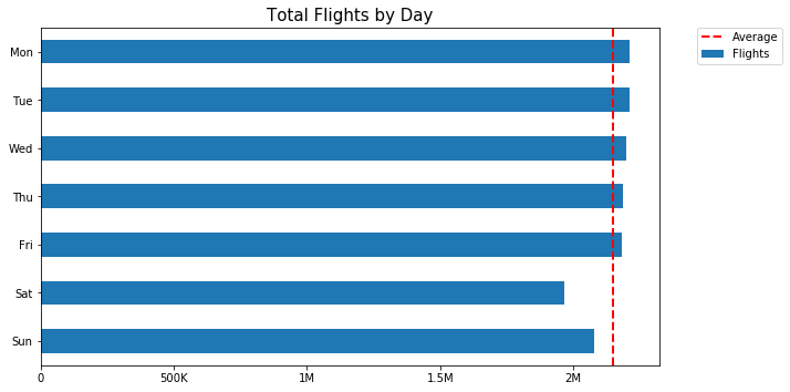
3.3. Total Flights by Day
In [19]:
# Extracting the day number from the dates
flight_day = df8991['Date'].dt.dayofweek

# Assigning the days
days = ['Mon', 'Tue', 'Wed', 'Thu', 'Fri', 'Sat', 'Sun']

# Creating a new dataframe
flight_day = pd.DataFrame(flight_day)

# Renaming the column name of the new dataframe
flight_day.rename(columns = {'Date':'Day'},inplace=True)

# Adding a new column to count flights per day
flight_day['Flights'] = df8991['Date'].dt.dayofweek.count

# Grouping the data by day
day_data  = flight_day.groupby('Day').count()
day_data['Day'] = days

# Renaming each day number to a real day name
flights_by_day = day_data.rename(index={0: 'Mon', 1: 'Tue', 2: 'Wed', 3: 'Thu', 4: 'Fri', 5: 'Sat', 6: 'Sun'})
flights_by_day.drop(columns=['Day'], axis=1, inplace=True)

# Looking at the dataframe we created
flights_by_day
Out[19]:
| Flights | |
|---|---|
| Day | |
| Mon | 2211445 |
| Tue | 2210868 |
| Wed | 2200217 |
| Thu | 2186411 |
| Fri | 2180619 |
| Sat | 1964556 |
| Sun | 2076898 |
In [20]:
flights_by_day['Flights'].pct_change()
Out[20]:
Day
Mon         NaN
Tue   -0.000261
Wed   -0.004818
Thu   -0.006275
Fri   -0.002649
Sat   -0.099083
Sun    0.057184
Name: Flights, dtype: float64
In [21]:
# Average flights per day
round(flights_by_day['Flights'].mean(), 2)
Out[21]:
2147287.71
In [22]:
# Working out percentage of flights compared to the weekly average
round(flights_by_day.loc['Sat','Flights']/flights_by_day['Flights'].mean()-1, 2)
Out[22]:
-0.09
In [23]:
# Plot
flights_by_day.reindex(index=flights_by_day.index[::-1]).plot(kind = 'barh', figsize=(10, 5), rot=0)

# Set title label
plt.title('Total Flights by Day', fontsize = 15)

# Set axis labels
plt.ylabel('', fontsize = 13)
plt.xlabel('', fontsize = 13)

# Ticks
ax = plt.gca()
ax.xaxis.set_major_formatter(tick.FuncFormatter(reformat_large_tick_values));
ax.axvline(flights_by_day['Flights'].mean(), color='red', linewidth=2, linestyle='dashed', label='Average')

# Legend
plt.legend(bbox_to_anchor=(1.2, 1), loc=1, borderaxespad=0.0)

# Show
plt.tight_layout(pad=1)
plt.savefig('images/charts/total_flights_by_day.png')
plt.show()
Observation 3: This plot shows us total flights by day. Monday has the most total flights with 2,211,445 but the difference between Monday and the other weekdays is rather negligable. Saturday shows a near 10% dip in flights compared to Monday while Sunday dips under 6% using the same comparison, this suggests passengers are flying more during the week than weekends. This chart shows a 10% variance between the day with the highest and lowest amount of flights, 3 years of data shows consistency in strong demand for flights regardless of the day of the week.
3.4. Total Flights by Hour
In [24]:
# Creating flight_hour
flight_hour = df8991['DepTime']

# Creating a new dataframe
flight_hour = pd.DataFrame(flight_hour)

# Extracting the hour from the times
flight_hour['FlightHour'] = df8991['DepTime'].str[:2]

# Adding a new column to count flights per hour
flight_hour['Flights'] = flight_hour['FlightHour'].count

# Drop column
flight_hour.drop(columns=['DepTime'], axis=1, inplace=True)

# Grouping the data by hour
hour_data  = flight_hour.groupby('FlightHour').count()
flights_by_hour = hour_data

# Looking at the dataframe we created
flights_by_hour
Out[24]:
| Flights | |
|---|---|
| FlightHour | |
| 00 | 61648 |
| 01 | 46131 |
| 02 | 8595 |
| 03 | 2593 |
| 04 | 5505 |
| 05 | 53452 |
| 06 | 779935 |
| 07 | 1049654 |
| 08 | 1103998 |
| 09 | 976624 |
| 10 | 834899 |
| 11 | 915756 |
| 12 | 977161 |
| 13 | 1032993 |
| 14 | 845945 |
| 15 | 882206 |
| 16 | 934469 |
| 17 | 988229 |
| 18 | 973944 |
| 19 | 842436 |
| 20 | 798213 |
| 21 | 503912 |
| 22 | 275905 |
| 23 | 136811 |
In [25]:
# Most popular flight hours
flights_by_hour.sort_values(by='Flights', ascending=False).head(5)
Out[25]:
| Flights | |
|---|---|
| FlightHour | |
| 08 | 1103998 |
| 07 | 1049654 |
| 13 | 1032993 |
| 17 | 988229 |
| 12 | 977161 |
In [26]:
# Least popular flight hours
flights_by_hour.sort_values(by='Flights', ascending=True).head(5)
Out[26]:
| Flights | |
|---|---|
| FlightHour | |
| 03 | 2593 |
| 04 | 5505 |
| 02 | 8595 |
| 01 | 46131 |
| 05 | 53452 |
In [27]:
# Working out x difference in flights between busiest hour compared to the quietest hour
round(flights_by_hour.loc['08','Flights']/flights_by_hour.loc['03','Flights'], 2)
Out[27]:
425.76
In [28]:
# Plot
flights_by_hour.plot(kind = 'bar', figsize=(14.70, 8.27), rot=0, legend=None)

# Set title label
plt.title('Total Flights by Hour\n', fontsize = 14)

# Set axis labels
plt.ylabel('Flights', fontsize = 10,  weight = "bold")
plt.xlabel('Time', fontsize = 10, weight = "bold")

# Ticks
ax = plt.gca()
ax.yaxis.set_major_formatter(tick.FuncFormatter(reformat_large_tick_values));

# Show
plt.tight_layout(pad=1)
plt.savefig('images/charts/total_flights_by_hour.png')
plt.show()
Observation 4: We can see the total flights by hour here based on departure time. 08:00 is the most popular time to fly with 1,103,998 flights according to departure time data from 1989-1991. We can see that there is a dip at 10:00, perhaps due to scheduling or other external reasons. The next dip we see on the chart is at 14:00 hours before recovering again until 18:00 where the flights steadily drop off. 03:00 recorded the lowest number of flights at only 2,593, that is a -426x difference in total flights vs 08:00. Flights between midnight and 05:00 are lower due to many factors including being the time people are generally sleeping but also noise restrictions. Maybe we can look at flight duration next?
3.5. Flight Duration in Minutes
In [29]:
df8991['ActualElapsedTime'].min(), df8991['ActualElapsedTime'].max()
Out[29]:
(-591, 1883)
In [30]:
df8991['CRSElapsedTime'].min(), df8991['CRSElapsedTime'].max()
Out[30]:
(-59, 1565)
In [31]:
df8991[df8991['CRSElapsedTime'] == -59]
Out[31]:
| Date | DayOfWeek | DepTime | CRSDepTime | ArrTime | CRSArrTime | UniqueCarrier | FlightNum | ActualElapsedTime | CRSElapsedTime | ArrDelay | DepDelay | Origin | Dest | Distance | Cancelled | Diverted | |
|---|---|---|---|---|---|---|---|---|---|---|---|---|---|---|---|---|---|
| 13266400 | 1991-08-08 | Thursday | 06:56:00 | 07:00:00 | 11:04:00 | 07:01:00 | NW | 312 | 188 | -59 | 243 | -4 | MSP | DCA | 931 | 0 | 0 |
In [32]:
# Looking for 'ActualElapsedTime' values under 0
df8991['ActualElapsedTime'][df8991['ActualElapsedTime'] < 0].count()
Out[32]:
29
In [33]:
# Looking for 'CRSElapsedTime' values under 0
df8991['CRSElapsedTime'][df8991['CRSElapsedTime'] < 0].count()
Out[33]:
12
In [34]:
# Creating flight_duration and dropping time values under 0
flight_duration = df8991['ActualElapsedTime'][df8991['ActualElapsedTime'] >= 0]

# Creating a new dataframe
flight_duration = pd.DataFrame(flight_duration)

# Extracting the duration data
flight_duration['FlightDuration'] = df8991['ActualElapsedTime']

# Adding a new column to count flights by duration
flight_duration['Flights'] = flight_duration['FlightDuration'].count

# Drop column
flight_duration.drop(columns=['ActualElapsedTime'], axis=1, inplace=True)

# Grouping the data by duration
duration_data  = flight_duration.groupby('FlightDuration').count()
flights_by_duration = duration_data

# Looking at the dataframe we created
flights_by_duration.head()
Out[34]:
| Flights | |
|---|---|
| FlightDuration | |
| 0 | 2 |
| 1 | 2 |
| 2 | 4 |
| 3 | 1 |
| 4 | 3 |
In [35]:
# Average flight duration
df8991['ActualElapsedTime'][df8991['ActualElapsedTime'] > 0].mean()
Out[35]:
109.90256206131029
In [36]:
# Median flight duration
df8991['ActualElapsedTime'][df8991['ActualElapsedTime'] > 0].median()
Out[36]:
91.0
In [37]:
# Percentage of flights over 300 minutes
df8991['ActualElapsedTime'][df8991['ActualElapsedTime'] > 300].count()/df8991['ActualElapsedTime'].count()
Out[37]:
0.018513654501286475
In [38]:
# Percentage of flights between 0 and 300 minutes
df8991['ActualElapsedTime'][df8991['ActualElapsedTime'].between(0, 300)].count()/df8991['ActualElapsedTime'].count()
Out[38]:
0.9814844161544923
In [39]:
# Checking the statistics
df8991['ActualElapsedTime'][df8991['ActualElapsedTime'] > 0].describe()
Out[39]:
count    1.503098e+07
mean     1.099026e+02
std      6.445965e+01
min      1.000000e+00
25%      6.400000e+01
50%      9.100000e+01
75%      1.400000e+02
max      1.883000e+03
Name: ActualElapsedTime, dtype: float64
In [40]:
# Maximum flight duration
df8991['ActualElapsedTime'].max()
Out[40]:
1883
In [41]:
# Plot
flights_by_duration.plot(kind = 'area', figsize=(7, 5), rot=0, legend=None)

# Set title label
plt.title('Total Flights by Duration', fontsize = 15)

# Set axis labels
plt.ylabel('', fontsize = 13)
plt.xlabel('Minutes', fontsize = 13)

# Ticks
ax = plt.gca()
ax.yaxis.set_major_formatter(tick.FuncFormatter(reformat_large_tick_values));

# Show
plt.tight_layout(pad=1)
plt.savefig('images/charts/total_flights_by_duration.png')
plt.show()

Observation 5: Total flights by duration shows us a lot of interesting insights. Our area graph above shows us flights average around 110 minutes while the median flight duration is 91 minutes. The longest flight duration was 1883 minutes which equates to over 31 hours! The conclusion is 98.1% of flights are under 300 minutes and the remaining 1.9% of flights are generally under 300 minutes or 5 hours. Distance is an ideal thing to look at next, how far do passengers travel and does flight distance vary depending on time?
3.6. Flight Distance in Miles
In [42]:
# Creating flight_distance
flight_distance = df8991['Distance']

# Creating a new dataframe
flight_distance = pd.DataFrame(flight_distance)

# Extracting the distance data
flight_distance['FlightDistance'] = df8991['Distance']

# Adding a new column to count flights by distance
flight_distance['Flights'] = flight_distance['FlightDistance'].count

# Drop column
flight_distance.drop(columns=['Distance'], axis=1, inplace=True)

# Grouping the data by distance
distance_data  = flight_distance.groupby('FlightDistance').count()
flights_by_distance = distance_data
flights_by_distance_idx = distance_data.reset_index()

# Looking at the dataframe we created
flights_by_distance.head()
Out[42]:
| Flights | |
|---|---|
| FlightDistance | |
| 0 | 1 |
| 11 | 889 |
| 17 | 4 |
| 18 | 2 |
| 21 | 5696 |
In [43]:
# Minimum and maxiumum distance travelled
df8991['Distance'].min(), df8991['Distance'].max()
Out[43]:
(0, 4502)
In [44]:
# Average flight distance
df8991['Distance'].mean()
Out[44]:
632.9591811969572
In [45]:
df8991['Distance'][df8991['Distance'] > 2800].count()/df8991['Distance'].count()
Out[45]:
0.0016491901344779533
In [46]:
# Plot
plt.hist(data = flights_by_distance_idx, x = 'FlightDistance', bins = 25) #, y = 'Flights'

# Set title label
plt.title('Total Flights by Distance', fontsize = 15)

# Set axis labels
plt.ylabel('', fontsize = 13)
plt.xlabel('Distance (Miles)', fontsize = 13)

# Ticks fixed for histogram
ax = plt.gca()
ax.yaxis.set_major_formatter(tick.FuncFormatter(lambda x, pos: '{:,.0f}'.format(x/1) + 'K'))

# Show
plt.tight_layout(pad=1)
plt.savefig('images/charts/total_flights_by_distance.png')
plt.show()
Observation 6: We are looking at total flights by distance using a histogram, flights are indicated on the left and distance is on the bottom. Most flights range from around 100 to 1000 miles and steadily decline after, with the average being 632 miles. 2500-3000 miles seems to be the point flights most drastically reduce. Statistically 0.1% of flights go over 2800 miles. Maybe we can look at carrier data to find some different correlations?
3.7. Flights by Carrier
In [47]:
# Creating flight_carrier
flight_carrier = df8991['UniqueCarrier']

# Creating a new dataframe
flight_carrier = pd.DataFrame(flight_carrier)

# Extracting the carrier data
flight_carrier['FlightCarrier'] = df8991['UniqueCarrier']

# Adding a new column to count flights by carrier
flight_carrier['Flights'] = flight_carrier['FlightCarrier'].count

# Drop column
flight_carrier.drop(columns=['UniqueCarrier'], axis=1, inplace=True)

# Grouping the data by carrier
carrier_data  = flight_carrier.groupby('FlightCarrier').count()
flights_by_carrier = carrier_data

# Looking at the dataframe we created
flights_by_carrier.head()
Out[47]:
| Flights | |
|---|---|
| FlightCarrier | |
| AA | 2084513 |
| AS | 267975 |
| CO | 1241287 |
| DL | 2430469 |
| EA | 398362 |
In [48]:
# Creating a filtered database for top 10 carriers ascending
carriers_top_10 = flights_by_carrier.sort_values('Flights', ascending=False).iloc[0:10]

# Dataframe without index
carriers_top_10_idx = carriers_top_10.reset_index()
In [49]:
# Top 10 Carriers
carriers_top_10
Out[49]:
| Flights | |
|---|---|
| FlightCarrier | |
| US | 2575160 |
| DL | 2430469 |
| AA | 2084513 |
| UA | 1774850 |
| NW | 1352989 |
| CO | 1241287 |
| WN | 950837 |
| TW | 756992 |
| HP | 623477 |
| EA | 398362 |
In [50]:
carriers.head()
Out[50]:
| code | description | |
|---|---|---|
| 0 | 02Q | Titan Airways |
| 1 | 04Q | Tradewind Aviation |
| 2 | 05Q | Comlux Aviation, AG |
| 3 | 06Q | Master Top Linhas Aereas Ltd. |
| 4 | 07Q | Flair Airlines Ltd. |
In [51]:
# Filter
carriers[carriers['code'] == 'US']
Out[51]:
| code | description | |
|---|---|---|
| 1308 | US | US Airways Inc. (Merged with America West 9/05… |
In [52]:
# Renaming column to prepare for df merge
carriers_top_10_idx.rename(columns={"FlightCarrier":"code"}, inplace=True)
In [53]:
# Merging dataframes to get the carrier description
carriers_top_10_idx2 = pd.merge(left=carriers_top_10_idx, right=carriers, how='left', on='code')
In [54]:
carriers_top_10_idx2
Out[54]:
| code | Flights | description | |
|---|---|---|---|
| 0 | US | 2575160 | US Airways Inc. (Merged with America West 9/05… |
| 1 | DL | 2430469 | Delta Air Lines Inc. |
| 2 | AA | 2084513 | American Airlines Inc. |
| 3 | UA | 1774850 | United Air Lines Inc. |
| 4 | NW | 1352989 | Northwest Airlines Inc. |
| 5 | CO | 1241287 | Continental Air Lines Inc. |
| 6 | WN | 950837 | Southwest Airlines Co. |
| 7 | TW | 756992 | Trans World Airways LLC |
| 8 | HP | 623477 | America West Airlines Inc. (Merged with US Air… |
| 9 | EA | 398362 | Eastern Air Lines Inc. |
In [55]:
carriers_top_10_idx2['description'] = carriers_top_10_idx2['description'].str.replace(r"\(.*\)","")
In [56]:
carriers_top_10_idx2
Out[56]:
| code | Flights | description | |
|---|---|---|---|
| 0 | US | 2575160 | US Airways Inc. |
| 1 | DL | 2430469 | Delta Air Lines Inc. |
| 2 | AA | 2084513 | American Airlines Inc. |
| 3 | UA | 1774850 | United Air Lines Inc. |
| 4 | NW | 1352989 | Northwest Airlines Inc. |
| 5 | CO | 1241287 | Continental Air Lines Inc. |
| 6 | WN | 950837 | Southwest Airlines Co. |
| 7 | TW | 756992 | Trans World Airways LLC |
| 8 | HP | 623477 | America West Airlines Inc. |
| 9 | EA | 398362 | Eastern Air Lines Inc. |
In [57]:
carriers_top_10_idx2['Flights'].pct_change()
Out[57]:
0         NaN
1   -0.056187
2   -0.142341
3   -0.148554
4   -0.237688
5   -0.082559
6   -0.233991
7   -0.203868
8   -0.176376
9   -0.361064
Name: Flights, dtype: float64
In [58]:
# Variables
labels = [' ',' ',' ',' ',' ',' ',' ',' ',' ',' ']
explode = [0.1, 0.01, 0.01, 0.01, 0.01, 0.01, 0.01, 0.01, 0.01, 0.01]

# Plot
carriers_top_10.plot(kind='pie', figsize=(14.70, 8.27), rot=0, subplots=True, labels=labels, legend=True,
                     cmap='jet', autopct='%1.1f%%', pctdistance=1.15, explode=explode)

# Legend
carrier_list = list(carriers_top_10_idx2['description'])
plt.legend(labels = carrier_list, bbox_to_anchor=(1.55, 1), loc=1, borderaxespad=0.0)

# Set title label
plt.title('Total Flights by Carrier', loc='center', fontsize = 15)

# Set axis labels
plt.ylabel('', fontsize = 13)
plt.xlabel('', fontsize = 13)

# Ticks
ax = plt.gca()
ax.yaxis.set_major_formatter(tick.FuncFormatter(reformat_large_tick_values));

# Show
plt.tight_layout(pad=1)
plt.savefig('images/charts/total_flights_by_carrier.png')
plt.show()
Observation 7: The total flights by carrier is a good indication of which airlines were the most popular between 1989 and 1991. The most popular carrier is US Airways Inc with 2,575,160 flights between 1989-1991, that represents an 18.1% share of all flights from our data. Delta Air Lines Inc. is a close 2nd place with 2,430,469 or a 5.6% difference from 1st place with a 17% share of the market. Those two airlines would have gone toe to toe dominating aviation at that time. However, American Airlines Inc. features in 3rd place with 2,084,513 flights with a strong 14.7% market share. The gap widens to a 14% difference in total flights vs 1st place. This trend continues as the other airlines share smaller and smaller stakes in the market. Perhaps later we can find out which airline is the most punctual?
3.8. Flight Distance by Day
In [59]:
# Grouping data by day of week then sorting index
weekday_cat = ['Monday', 'Tuesday', 'Wednesday', 'Thursday', 'Friday', 'Saturday', 'Sunday']
weekday = df8991.drop(['FlightNum'], axis=1).groupby(['DayOfWeek']).mean().reindex(weekday_cat)

# Rename index variable
idx = {"Monday": "Mon", "Tuesday":"Tue", "Wednesday":"Wed", "Thursday":"Thu", "Friday":"Fri", "Saturday":"Sat", "Sunday":"Sun"}
In [60]:
weekday.head(7)
Out[60]:
| ActualElapsedTime | CRSElapsedTime | ArrDelay | DepDelay | Distance | Cancelled | Diverted | |
|---|---|---|---|---|---|---|---|
| DayOfWeek | |||||||
| Monday | 109.058930 | 109.488231 | 4.964975 | 5.425532 | 628.187534 | 0.0 | 0.0 |
| Tuesday | 109.530635 | 109.422163 | 6.213578 | 6.144185 | 627.741170 | 0.0 | 0.0 |
| Wednesday | 109.712301 | 109.355599 | 7.021518 | 6.684452 | 627.115591 | 0.0 | 0.0 |
| Thursday | 110.101038 | 109.411749 | 8.744248 | 8.079987 | 627.562929 | 0.0 | 0.0 |
| Friday | 110.096784 | 109.529341 | 9.349141 | 8.810754 | 628.533479 | 0.0 | 0.0 |
| Saturday | 110.790458 | 112.260839 | 4.769930 | 6.301211 | 650.885998 | 0.0 | 0.0 |
| Sunday | 110.143351 | 111.337036 | 5.055255 | 6.310329 | 643.155490 | 0.0 | 0.0 |
In [61]:
weekday['Distance']
Out[61]:
DayOfWeek
Monday       628.187534
Tuesday      627.741170
Wednesday    627.115591
Thursday     627.562929
Friday       628.533479
Saturday     650.885998
Sunday       643.155490
Name: Distance, dtype: float64
In [62]:
# Figsize
fig = ax.get_figure()
plt.figure(figsize = [15, 6])
plt.suptitle('Elapsed Time and Distance vs Day', fontsize=15)

# Plot 1
plt.subplot(1, 2, 1)
weekday['ActualElapsedTime'].rename(index = idx, inplace = False).plot(kind = 'line', title='Actual Elapsed Time', legend=None)
plt.xlabel('')
plt.ylabel('')

# Plot 2
plt.subplot(1, 2, 1)
weekday['CRSElapsedTime'].rename(index = idx, inplace = False).plot(kind = 'line', title='Actual Elapsed Time vs CRS Elapsed Time (Min)', legend=None)
plt.legend()
plt.xlabel('')
plt.ylabel('')

# Plot 3
plt.subplot(1, 2, 2)
weekday['Distance'].rename(index = idx, inplace = False).plot(kind = 'line', title='Distance (Miles)', legend=None)
plt.xlabel('')
plt.ylabel('')

# Show
fig.tight_layout()
fig.subplots_adjust(top=2)
plt.savefig('images/charts/time_vs_distance_vs_day.png')
plt.show()
Observation 8: Elapsed time and distance versus day is a good way to find correlation between time of the week and flight delays with distance. Flight time seems to increase as the week passes. The weekend has the longest flights on average, indicating passengers might be travelling on weekend holidays but commute on weekdays. We also know from other data that fewer flights take place during the weekend but also delays are lower while flight duration and distance is longer on average. We should look into delays more, which airports are the most punctual and which are the least?
3.9. Delay by Origin and Destination
In [63]:
df8991['Origin'].unique()
Out[63]:
array(['SFO', 'DEN', 'HNL', 'LIH', 'PHL', 'OGG', 'IAD', 'EWR', 'LAX',
       'KOA', 'ORD', 'MKE', 'IAH', 'MSY', 'RIC', 'SEA', 'FLL', 'MCO',
       'BWI', 'HOU', 'MCI', 'SJC', 'CMH', 'OMA', 'ORF', 'BOS', 'ABQ',
       'SMF', 'OKC', 'SGF', 'SLC', 'ONT', 'SAN', 'BUF', 'LGB', 'MIA',
       'BDL', 'IND', 'TPA', 'SYR', 'PIT', 'STL', 'PDX', 'CLT', 'PHX',
       'CVG', 'MBS', 'ATL', 'DSM', 'LAS', 'AUS', 'JAN', 'MEM', 'DTW',
       'SRQ', 'MSP', 'DFW', 'PSP', 'MDT', 'FAT', 'BGR', 'PWM', 'ROC',
       'MDW', 'FAR', 'CHS', 'SAV', 'LGA', 'ANC', 'FSD', 'OAK', 'CLE',
       'CAE', 'TUL', 'HPN', 'GSO', 'RDU', 'DAY', 'GRR', 'MSN', 'JAX',
       'BNA', 'COS', 'SAT', 'CID', 'PBI', 'GEG', 'LNK', 'PVD', 'BIL',
       'SBA', 'ELP', 'SDF', 'TUS', 'SNA', 'ICT', 'BUR', 'ABE', 'RAP',
       'GTF', 'LIT', 'ALB', 'RNO', 'BHM', 'HSV', 'BOI', 'DCA', 'SUX',
       'TYS', 'MHT', 'EUG', 'MLI', 'BTV', 'PIA', 'FAI', 'MFR', 'MRY',
       'JFK', 'RSW', 'ERI', 'PHF', 'PSC', 'ISP', 'AVP', 'EVV', 'ELM',
       'LEX', 'ORH', 'BGM', 'TRI', 'CRW', 'TOL', 'MYR', 'ITH', 'GSP',
       'HTS', 'ACY', 'BLI', 'SCK', 'RDM', 'CCR', 'YKM', 'DAL', 'LBB',
       'CRP', 'AMA', 'HRL', 'MAF', 'DET', 'VPS', 'AZO', 'FWA', 'DLH',
       'ATW', 'GRB', 'BIS', 'GPT', 'LAN', 'GFK', 'RST', 'BZN', 'EAU',
       'LSE', 'MOT', 'MOB', 'MSO', 'BTR', 'CHA', 'SHV', 'MGM', 'PFN',
       'HDN', 'SBN', 'STT', 'STX', 'FAY', 'AVL', 'CAK', 'OAJ', 'TLH',
       'ROA', 'ILM', 'AGS', 'DAB', 'FNT', 'ISO', 'CHO', 'CMI', 'LYH',
       'UCA', 'PNS', 'EYW', 'APF', 'GNV', 'SJU', 'PUB', 'MLU', 'MLB',
       'CSG', 'CPR', 'IDA', 'JAC', 'HLN', 'FCA', 'JNU', 'BTM', 'DRO',
       'GJT', 'YUM', 'FLG', 'GCN', 'PIE', 'TVL', 'BFL', 'GUC', 'BET',
       'OME', 'OTZ', 'SCC', 'CDV', 'YAK', 'PSG', 'SIT', 'WRG', 'GUM',
       'MFE', 'LFT', 'YAP', 'ROR', 'SPN', 'ROP', 'TVC', 'GST', 'EGE',
       'SUN', 'PMD', 'SWF', 'EFD', 'PSE', 'HVN', 'TTN', 'BQN', 'SPI'],
      dtype=object)
In [64]:
origin = df8991.drop(['FlightNum'], axis=1).groupby(['Origin']).mean()
In [65]:
dest = df8991.drop(['FlightNum'], axis=1).groupby(['Dest']).mean()
In [66]:
origin['DepDelay'].sort_values(ascending=False).iloc[0:10]
Out[66]:
Origin
PSE    22.716667
YAP    19.763158
SUN    14.538462
HDN    12.525217
JFK    11.455878
ORD    10.036105
GUC     9.815362
JNU     9.490426
EWR     8.866009
PIT     8.842862
Name: DepDelay, dtype: float64
In [67]:
# Assigning high and low airport delay
aplow_delay = (origin['DepDelay'].sort_values(ascending=False)+dest['ArrDelay']).sort_values(ascending=True).iloc[0:10].sort_values(ascending=False)
aphigh_delay = (origin['DepDelay'].sort_values(ascending=False)+dest['ArrDelay']).sort_values(ascending=False).iloc[0:10].sort_values(ascending=True)
In [68]:
# Top 10 lowest delay airports
aplow_delay.sort_values(ascending=True)
Out[68]:
BQN   -10.351648
ATW    -5.999804
YKM     0.053702
MOT     0.203609
EAU     0.944523
PMD     1.263444
ROP     1.655739
LFT     2.202046
PUB     2.252053
GRB     2.559022
dtype: float64
In [69]:
# Top 10 highest delay airports
aphigh_delay.sort_values(ascending=False)
Out[69]:
PSE    53.250000
SUN    38.038462
YAP    37.362168
HDN    22.337867
GST    20.760290
SIT    20.030887
GUC    19.211647
JFK    18.920419
JNU    18.902215
SFO    18.836069
dtype: float64
In [70]:
# Chart 1
plt.subplot(1, 2, 1)
origin['DepDelay'].sort_values(ascending=False).iloc[0:10].plot(
    kind = 'barh', figsize=(10, 5), legend=None, title='Departure Airports by Delay')

# Chart 2
plt.subplot(1, 2, 2)
dest['ArrDelay'].sort_values(ascending=False).iloc[0:10].plot(
    kind = 'barh', figsize=(10, 5), legend=None, title='Arrival Airports by Delay', label='Delay in minutes')

# Show
plt.tight_layout(pad=1)
plt.savefig('images/charts/delay_by_origin_dest.png')
plt.show()
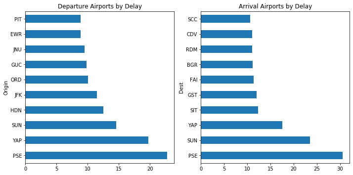
Here we are looking at airports ranked by average delay times. PIT is has the lowest departure delays but PSE has the highest departure delays on average. SCC has the lowest arrival delays and PSE has the highest departure delays. We should look at total delay now, this should be easily done by adding the departure and arrival times.In [71]:
# Chart 1
plt.subplot(1, 2, 1)
aphigh_delay.plot(
    kind = 'barh', figsize=(10, 5), legend=None, title='Top 10 Airports by Highest Total Delay')

# Chart 2
plt.subplot(1, 2, 2)
aplow_delay.plot(
    kind = 'barh', figsize=(10, 5), legend=None, title='Top 10 Airports by Lowest Total Delay')

# Show
plt.tight_layout(pad=1)
plt.savefig('images/charts/delay_by_airport.png')
plt.show()
Observation 9: The above plot shows airports by total delay this time. PSE – Mercedita Airport has the highest average delays at 53.2 minutes. BQN – Rafael Hernández Airport has the lowest average delays at -10.35 minutes. In other words, flights arrive 10 minutes early on average.In [72]:
# Airline carrier filter
carriers[carriers['code'] == 'UA']
Out[72]:
| code | description | |
|---|---|---|
| 1297 | UA | United Air Lines Inc. |
In [73]:
# Airport name filter
airports[airports['iata'] == 'PSE']
Out[73]:
| iata | airport | city | state | country | lat | long | |
|---|---|---|---|---|---|---|---|
| 2674 | PSE | Mercedita | Ponce | PR | USA | 18.008303 | -66.563012 |
In [74]:
# Airports by flights
(df8991['Origin'] == 'ATW').sum()+(df8991['Dest'] == 'ATW').sum()
Out[74]:
1861
Step 4: Bivariate Exploration ?
4.1. Airports by Traffic
In [75]:
df8991['Dest'].unique()
Out[75]:
array(['HNL', 'IAD', 'SFO', 'DEN', 'LIH', 'LAX', 'PDX', 'ORD', 'KOA',
       'OGG', 'BOS', 'EWR', 'IAH', 'MSY', 'PHX', 'OMA', 'ABE', 'SDF',
       'DFW', 'PHL', 'BTV', 'FAT', 'DTW', 'ABQ', 'TUL', 'AUS', 'MSP',
       'PIT', 'GSO', 'SMF', 'TUS', 'IND', 'GRR', 'HOU', 'ORF', 'SJC',
       'SAN', 'CMH', 'SEA', 'MCI', 'MEM', 'BDL', 'TPA', 'PBI', 'FSD',
       'BWI', 'DSM', 'CVG', 'MCO', 'MHT', 'PWM', 'BGR', 'BOI', 'RDU',
       'LAS', 'DAY', 'SAV', 'CHS', 'FAI', 'ANC', 'CLE', 'OAK', 'ICT',
       'OKC', 'MKE', 'GEG', 'LIT', 'TYS', 'BNA', 'BUF', 'COS', 'FAR',
       'SGF', 'LNK', 'SUX', 'RAP', 'GTF', 'BIL', 'CLT', 'ONT', 'SLC',
       'ATL', 'STL', 'MIA', 'MSN', 'MRY', 'JAX', 'MBS', 'CAE', 'RNO',
       'HPN', 'ROC', 'ALB', 'RSW', 'RIC', 'SBA', 'SAT', 'LGB', 'PVD',
       'HSV', 'MDT', 'JAN', 'DCA', 'BUR', 'JFK', 'SNA', 'PSP', 'SYR',
       'FLL', 'BHM', 'MLI', 'PIA', 'CID', 'SRQ', 'LGA', 'MDW', 'ELP',
       'EUG', 'MFR', 'ERI', 'AVP', 'ISP', 'PSC', 'EVV', 'MYR', 'GSP',
       'PHF', 'ITH', 'CRW', 'BGM', 'TOL', 'LEX', 'ELM', 'ORH', 'HTS',
       'TRI', 'ACY', 'SCK', 'CCR', 'YKM', 'RDM', 'BLI', 'HRL', 'DAL',
       'AMA', 'LBB', 'CRP', 'MAF', 'DET', 'GRB', 'FWA', 'RST', 'DLH',
       'AZO', 'GFK', 'LAN', 'LSE', 'EAU', 'BZN', 'MOT', 'BIS', 'MOB',
       'GPT', 'MSO', 'CHA', 'ATW', 'SHV', 'VPS', 'MGM', 'BTR', 'PFN',
       'HDN', 'SBN', 'STT', 'STX', 'CAK', 'FNT', 'AVL', 'OAJ', 'FAY',
       'ROA', 'ISO', 'DAB', 'ILM', 'AGS', 'CMI', 'TLH', 'CHO', 'LYH',
       'UCA', 'PNS', 'EYW', 'GNV', 'APF', 'SJU', 'PUB', 'MLB', 'MLU',
       'CSG', 'CPR', 'JAC', 'FCA', 'HLN', 'IDA', 'JNU', 'BTM', 'GJT',
       'YUM', 'DRO', 'FLG', 'GCN', 'BFL', 'GUC', 'PIE', 'TVL', 'BET',
       'OME', 'OTZ', 'SCC', 'YAK', 'CDV', 'SIT', 'PSG', 'WRG', 'GUM',
       'MFE', 'LFT', 'YAP', 'ROR', 'SPN', 'ROP', 'TVC', 'GST', 'EGE',
       'SUN', 'PMD', 'SWF', 'EFD', 'PSE', 'HVN', 'TTN', 'BQN', 'SPI'],
      dtype=object)
In [76]:
# Extracting the month number from the dates
flight_dest = df8991['Date'].dt.month

# Assigning the months
months = ['Jan','Feb','Mar','Apr','May','Jun','Jul','Aug','Sep','Oct','Nov','Dec']

# Creating a new dataframe
flight_dest = pd.DataFrame(flight_dest)

# Renaming the column name of the new dataframe
flight_dest.rename(columns = {'Date':'Month'},inplace=True)

# Adding a new column to count flights per month
flight_dest['Flights'] = df8991['Date'].dt.month.count

# Adding a new column to sum destinations per month
flight_dest['Dest'] = df8991['Dest']

# Grouping the data by month then assigning month names to 'month' column
month_dest  = flight_dest.groupby([('Month'),('Dest')]).count()

# Renaming each month number to a real month name
flights_by_dest = month_dest.rename(index={1: 'Jan', 2: 'Feb', 3: 'Mar', 4: 'Apr', 5: 'May', 6: 'Jun', 7: 'Jul', 8: 'Aug', 9: 'Sep', 10: 'Oct', 11: 'Nov', 12: 'Dec'})

# Looking at the dataframe we created
flights_by_dest.head()
Out[76]:
| Flights | ||
|---|---|---|
| Month | Dest | |
| Jan | ABE | 1281 |
| ABQ | 7264 | |
| ACY | 160 | |
| AGS | 780 | |
| ALB | 3203 |
In [77]:
flights_by_dest_piv = flights_by_dest.reset_index().pivot(columns='Month',index='Dest',values='Flights')
flights_by_dest_piv = flights_by_dest_piv.reindex(columns= ['Jan','Feb','Mar','Apr','May','Jun','Jul','Aug','Sep','Oct','Nov','Dec'])
In [78]:
flights_by_dest_piv.head()
Out[78]:
| Month | Jan | Feb | Mar | Apr | May | Jun | Jul | Aug | Sep | Oct | Nov | Dec |
|---|---|---|---|---|---|---|---|---|---|---|---|---|
| Dest | ||||||||||||
| ABE | 1281.0 | 1155.0 | 1169.0 | 1151.0 | 1276.0 | 1319.0 | 1499.0 | 1508.0 | 1490.0 | 1599.0 | 1540.0 | 1519.0 |
| ABQ | 7264.0 | 6549.0 | 7691.0 | 7645.0 | 7947.0 | 7708.0 | 7900.0 | 7909.0 | 7580.0 | 7826.0 | 7281.0 | 7311.0 |
| ACY | 160.0 | 144.0 | 163.0 | 162.0 | 209.0 | 211.0 | 249.0 | 242.0 | 188.0 | 190.0 | 182.0 | 184.0 |
| AGS | 780.0 | 703.0 | 782.0 | 747.0 | 796.0 | 789.0 | 796.0 | 809.0 | 784.0 | 810.0 | 789.0 | 823.0 |
| ALB | 3203.0 | 2989.0 | 3260.0 | 3215.0 | 3256.0 | 3160.0 | 3238.0 | 3312.0 | 3193.0 | 3356.0 | 3097.0 | 3165.0 |
In [79]:
flights_by_dest_piv.columns
Out[79]:
Index(['Jan', 'Feb', 'Mar', 'Apr', 'May', 'Jun', 'Jul', 'Aug', 'Sep', 'Oct',
       'Nov', 'Dec'],
      dtype='object', name='Month')
In [80]:
flights_by_dest_piv.sort_values(by=['Dest'], axis=0, ascending=False).head()
Out[80]:
| Month | Jan | Feb | Mar | Apr | May | Jun | Jul | Aug | Sep | Oct | Nov | Dec |
|---|---|---|---|---|---|---|---|---|---|---|---|---|
| Dest | ||||||||||||
| YUM | 463.0 | 412.0 | 451.0 | 435.0 | 411.0 | 372.0 | 374.0 | 404.0 | 364.0 | 391.0 | 373.0 | 430.0 |
| YKM | 60.0 | 51.0 | 55.0 | 59.0 | 1.0 | NaN | NaN | NaN | NaN | NaN | NaN | NaN |
| YAP | 42.0 | 38.0 | 47.0 | 52.0 | 54.0 | 24.0 | 20.0 | 27.0 | 26.0 | 23.0 | 24.0 | 27.0 |
| YAK | 160.0 | 121.0 | 166.0 | 171.0 | 168.0 | 164.0 | 173.0 | 174.0 | 152.0 | 166.0 | 151.0 | 144.0 |
| WRG | 63.0 | 64.0 | 77.0 | 83.0 | 87.0 | 86.0 | 81.0 | 84.0 | 78.0 | 85.0 | 59.0 | 62.0 |
In [81]:
# Filling NaN with 0
flights_by_dest_piv = flights_by_dest_piv.fillna(0)

# Changing from float to np.int64 to remove .0
flights_by_dest_piv = flights_by_dest_piv.astype(np.int64)

# Summing across the rows using .sum and 'axis=0'
flights_by_dest_piv['Total'] = flights_by_dest_piv.sum(axis=1).astype(np.int64)
In [82]:
top_10_dest = flights_by_dest_piv.sort_values(by='Total', ascending=False).iloc[0:10,0:12]
top_10_dest
Out[82]:
| Month | Jan | Feb | Mar | Apr | May | Jun | Jul | Aug | Sep | Oct | Nov | Dec |
|---|---|---|---|---|---|---|---|---|---|---|---|---|
| Dest | ||||||||||||
| ORD | 64860 | 58108 | 66654 | 66439 | 68519 | 66286 | 67693 | 68390 | 65764 | 67931 | 63949 | 66085 |
| DFW | 38769 | 34937 | 58998 | 58056 | 59562 | 59201 | 61925 | 62389 | 60610 | 61807 | 59015 | 61795 |
| ATL | 57380 | 51969 | 51962 | 50441 | 52188 | 52102 | 55742 | 58388 | 58889 | 62291 | 59045 | 60404 |
| LAX | 39072 | 34862 | 39950 | 39503 | 41515 | 41261 | 42912 | 42905 | 39996 | 41003 | 39004 | 39192 |
| DEN | 33867 | 30862 | 35191 | 34093 | 34796 | 34488 | 35836 | 36688 | 33778 | 34459 | 32398 | 34396 |
| PHX | 32979 | 29793 | 34678 | 33877 | 34737 | 33711 | 34804 | 34720 | 32948 | 34131 | 32723 | 33877 |
| STL | 30506 | 27696 | 31060 | 30712 | 31455 | 31567 | 32828 | 33232 | 31617 | 32362 | 29153 | 29462 |
| SFO | 30068 | 26649 | 30753 | 30482 | 31827 | 31614 | 32985 | 33238 | 30755 | 31824 | 29794 | 30346 |
| DTW | 29098 | 26382 | 29715 | 29650 | 30752 | 29824 | 30642 | 31366 | 29435 | 30746 | 28619 | 29245 |
| PIT | 29062 | 26246 | 29307 | 28722 | 29731 | 28558 | 29588 | 29576 | 28745 | 29720 | 28388 | 28690 |
In [83]:
df8991['Dest'].value_counts().head(10)
Out[83]:
ORD    790678
DFW    677064
ATL    670801
LAX    481175
DEN    410852
PHX    402978
STL    371650
SFO    370335
DTW    355474
PIT    346333
Name: Dest, dtype: int64
In [84]:
df8991['Origin'].value_counts().head(10)
Out[84]:
ORD    774861
ATL    669767
DFW    662101
LAX    482516
DEN    405662
PHX    400611
SFO    374001
STL    366913
DTW    349453
PIT    343552
Name: Origin, dtype: int64
In [85]:
# Extracting the month number from the dates
flight_origin = df8991['Date'].dt.month

# Assigning the months
months = ['Jan','Feb','Mar','Apr','May','Jun','Jul','Aug','Sep','Oct','Nov','Dec']

# Creating a new dataframe
flight_origin = pd.DataFrame(flight_origin)

# Renaming the column name of the new dataframe
flight_origin.rename(columns = {'Date':'Month'},inplace=True)

# Adding a new column to count flights per month
flight_origin['Flights'] = df8991['Date'].dt.month.count

# Adding a new column to sum origininations per month
flight_origin['Origin'] = df8991['Origin']

# Grouping the data by month then assigning month names to 'month' column
month_origin  = flight_origin.groupby([('Month'),('Origin')]).count()

# Renaming each month number to a real month name
flights_by_origin = month_origin.rename(index={1: 'Jan', 2: 'Feb', 3: 'Mar', 4: 'Apr', 5: 'May', 6: 'Jun', 7: 'Jul', 8: 'Aug', 9: 'Sep', 10: 'Oct', 11: 'Nov', 12: 'Dec'})

# Looking at the dataframe we created
flights_by_origin.head()
Out[85]:
| Flights | ||
|---|---|---|
| Month | Origin | |
| Jan | ABE | 1301 |
| ABQ | 7335 | |
| ACY | 163 | |
| AGS | 788 | |
| ALB | 3268 |
In [86]:
flights_by_origin_piv = flights_by_origin.reset_index().pivot(columns='Month',index='Origin',values='Flights')
flights_by_origin_piv = flights_by_origin_piv.reindex(columns= ['Jan','Feb','Mar','Apr','May','Jun','Jul','Aug','Sep','Oct','Nov','Dec'])
In [87]:
# Filling NaN with 0
flights_by_origin_piv = flights_by_origin_piv.fillna(0)

# Changing from float to np.int64 to remove .0
flights_by_origin_piv = flights_by_origin_piv.astype(np.int64)

# Summing across the rows using .sum and 'axis=0'
flights_by_origin_piv['Total'] = flights_by_origin_piv.sum(axis=1).astype(np.int64)
In [88]:
top_10_origin = flights_by_origin_piv.sort_values(by='Total', ascending=False).iloc[0:10,0:12]
top_10_origin
Out[88]:
| Month | Jan | Feb | Mar | Apr | May | Jun | Jul | Aug | Sep | Oct | Nov | Dec |
|---|---|---|---|---|---|---|---|---|---|---|---|---|
| Origin | ||||||||||||
| ORD | 63683 | 57104 | 65155 | 65023 | 67217 | 64757 | 66369 | 66467 | 64726 | 66832 | 62869 | 64659 |
| ATL | 57224 | 51831 | 51889 | 50462 | 52186 | 51917 | 55763 | 58313 | 58726 | 62141 | 58936 | 60379 |
| DFW | 37532 | 34338 | 57383 | 56859 | 58287 | 57753 | 60299 | 60768 | 59686 | 60774 | 57928 | 60494 |
| LAX | 39260 | 34981 | 40132 | 39607 | 41546 | 41426 | 42986 | 43020 | 40053 | 41105 | 39040 | 39360 |
| DEN | 33559 | 30592 | 34759 | 33763 | 34374 | 33898 | 35128 | 36124 | 33433 | 34119 | 31922 | 33991 |
| PHX | 32876 | 29661 | 34464 | 33563 | 34596 | 33422 | 34562 | 34440 | 32777 | 33942 | 32553 | 33755 |
| SFO | 30341 | 27027 | 31162 | 30702 | 32088 | 31962 | 33370 | 33629 | 30964 | 32088 | 30019 | 30649 |
| STL | 30176 | 27306 | 30606 | 30396 | 31023 | 31093 | 32449 | 32837 | 31197 | 31883 | 28845 | 29102 |
| DTW | 28584 | 25911 | 29229 | 29155 | 30192 | 29321 | 30138 | 30906 | 28979 | 30265 | 28131 | 28642 |
| PIT | 28787 | 26041 | 29022 | 28528 | 29542 | 28366 | 29325 | 29314 | 28534 | 29451 | 28215 | 28427 |
In [89]:
import seaborn as sns
fig, (ax1, ax2, axcb) = plt.subplots(1,3, figsize=(15,6), gridspec_kw={'width_ratios':[1.05,1,0.08]})

# Plot
fig.suptitle('Top 10 Airports by Flights', fontsize=15)
ax1.title.set_text('Origin Airports')
ax2.title.set_text('Destination Airports')
sns.heatmap(top_10_origin, cmap='Purples', linewidths=5, cbar=None, ax=ax1)
sns.heatmap(top_10_dest, cmap='Purples', linewidths=5, cbar_ax=axcb, ax=ax2)

# Show
#plt.tight_layout(pad=3)
plt.savefig('images/charts/top_10_airports_by_flights.png')
plt.show()
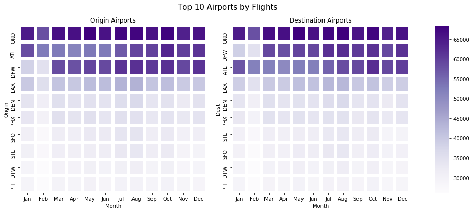
On the left shows the top 10 airports by flights departed and on the right are the destinations by flights arrived. ORD – Chicago O’Hare International has the most flights based on departure and arrivals which suggests it’s a hub for flights across America. ATL – Atlanta International has the 2nd most flights based on departure but 3rd based on arrival. DFW – Dallas-Fort Worth International is 3rd in departures but 2nd in arrivals, the opposite of ATL. This means flights between those two airports are common. We could delve deeper into that if we need to later.In [90]:
# Sum dataframes
top_10_airports = top_10_origin.rename_axis(index='Airport')+top_10_dest.rename_axis(index='Airport')
top_10_airports['Total'] = top_10_airports.sum(axis=1).astype(np.int64)

# Sorting values
top_10_ap_total = top_10_airports['Total']
top_10_airports = top_10_airports.sort_values(by='Total', ascending=False).iloc[0:10,0:12]
In [91]:
# Top 10 airports by total flights
top_10_ap_total.sort_values(ascending=False)
Out[91]:
Airport
ORD    1565539
ATL    1340568
DFW    1339165
LAX     963691
DEN     816514
PHX     803589
SFO     744336
STL     738563
DTW     704927
PIT     689885
Name: Total, dtype: int64
In [92]:
# Plot
fig, ax = plt.subplots(figsize=(14.70, 8.27))
sns.heatmap(top_10_airports.iloc[0:10,0:12], cmap='Blues', linewidths=5, cbar='Blues')

# Labels
ax.set_title('Top 10 Airports by Total Flights\n', fontsize=14, weight='bold')
plt.xlabel('Month'.title(),
               fontsize = 10, weight = "bold")
plt.ylabel('Airport'.title(),
               fontsize = 10, weight = "bold")

# Show
#plt.tight_layout(pad=0)
plt.savefig('images/charts/top_10_airports_by_total_flights.png')
plt.show()
Observation 10: This plot shows us the top 10 airports by total inbound and outbound flights. The chart is topped by Chicago O’Hare International in 1st place with 1,565,539 flights. 2nd place is William B Hartsfield-Atlanta International with 1,340,568, and close 3rd is Dallas-Fort Worth International with 1,339,165. During the summer Chicago O’Hare International is very busy with strong demand throughout the year. Atlanta International follows a similar trend but Dallas-Fort Worth International show a weak January and Feburary in terms of total flights.In [93]:
# Dataframe without index
top_10_origin_idx = top_10_origin.reset_index().iloc[:,0:1]

# Renaming column to prepare for df merge
top_10_origin_idx.rename(columns={"Origin":"iata"}, inplace=True)

# Merging dataframes to get the airport description
top_10_origin_desc = pd.merge(left=top_10_origin_idx, right=airports, how='left', on='iata')

# Show airport data
top_10_origin_desc.iloc[:,:-2]
Out[93]:
| iata | airport | city | state | country | |
|---|---|---|---|---|---|
| 0 | ORD | Chicago O’Hare International | Chicago | IL | USA |
| 1 | ATL | William B Hartsfield-Atlanta Intl | Atlanta | GA | USA |
| 2 | DFW | Dallas-Fort Worth International | Dallas-Fort Worth | TX | USA |
| 3 | LAX | Los Angeles International | Los Angeles | CA | USA |
| 4 | DEN | Denver Intl | Denver | CO | USA |
| 5 | PHX | Phoenix Sky Harbor International | Phoenix | AZ | USA |
| 6 | SFO | San Francisco International | San Francisco | CA | USA |
| 7 | STL | Lambert-St Louis International | St Louis | MO | USA |
| 8 | DTW | Detroit Metropolitan-Wayne County | Detroit | MI | USA |
| 9 | PIT | Pittsburgh International | Pittsburgh | PA | USA |
In [94]:
top_10_origin_desc['long'].describe()
Out[94]:
count     10.000000
mean     -98.076828
std       15.373173
min     -122.374843
25%     -110.172792
50%      -93.698595
75%      -85.296324
max      -80.232871
Name: long, dtype: float64
In [95]:
top_10_ap_total.sort_values(ascending=False)
Out[95]:
Airport
ORD    1565539
ATL    1340568
DFW    1339165
LAX     963691
DEN     816514
PHX     803589
SFO     744336
STL     738563
DTW     704927
PIT     689885
Name: Total, dtype: int64
4.2. Airlines by Month vs Average Distance
In [96]:
# Creating a Unique Carrier dataframe
UC1 = df8991['UniqueCarrier'].groupby(df8991['Date'].map(lambda x: x.month)).nunique().dropna()
UC2 = round(df8991['Distance'].groupby(df8991['Date'].map(lambda x: x.month)).mean(), 2)

# Merge and reindex dataframes
carriers_month_v_distance = pd.merge(left=UC1, right=UC2, how='left', on='Date')
carriers_month_v_distance = carriers_month_v_distance.rename(index={1: 'Jan', 2: 'Feb', 3: 'Mar', 4: 'Apr', 5: 'May', 6: 'Jun',
                                                                    7: 'Jul', 8: 'Aug', 9: 'Sep', 10: 'Oct', 11: 'Nov', 12: 'Dec'})
# Rename Columns
carriers_month_v_distance.rename_axis("Month", axis="index", inplace=True)
carriers_month_v_distance.rename(columns = {'UniqueCarrier':'CarrierCount'},inplace=True)

# Saving as a new dataframe
carriers_month_v_distance = pd.DataFrame(carriers_month_v_distance)

# Show
carriers_month_v_distance
Out[96]:
| CarrierCount | Distance | |
|---|---|---|
| Month | ||
| Jan | 14 | 619.77 |
| Feb | 14 | 623.41 |
| Mar | 14 | 630.20 |
| Apr | 14 | 628.60 |
| May | 14 | 629.13 |
| Jun | 14 | 635.24 |
| Jul | 14 | 640.34 |
| Aug | 14 | 639.94 |
| Sep | 13 | 635.37 |
| Oct | 13 | 634.70 |
| Nov | 12 | 636.83 |
| Dec | 12 | 640.03 |
In [97]:
# Creating a combo chart
fig, ax1 = plt.subplots(figsize=(10,6))
color = 'tab:green'

# Creating Bar Plot
ax1.set_title('Airlines by Month vs Average Distance', fontsize=15)
ax1 = sns.barplot(x='Month', y='CarrierCount', data=carriers_month_v_distance.reset_index(), palette='summer')
ax1.set_xlabel('Month', fontsize=13)
ax1.set_ylabel('Carriers', fontsize=13, color=color, weight='bold')
ax1.tick_params(axis='y')

# Sharing the same x-axis
ax2 = ax1.twinx()
color = 'tab:red'

# Creating Line Plot
ax2 = sns.lineplot(x='Month', y='Distance', data=carriers_month_v_distance.reset_index(),
                   sort=False, color=color, linewidth = 2, marker='o')
ax2.set_ylabel('\nAverage Distance (Mi)', fontsize=13, color=color, weight='bold')
ax2.tick_params(axis='y', color=color)

# Show
#plt.tight_layout(pad=3)
plt.savefig('images/charts/airlines_by_month_vs_distance.png')
plt.show()
Observation 11: Above is a combination chart showing us the amount of carriers active each month along with the average distance flown. On average, we can count around 12-14 carriers on any given month but the chart shows us from September the amount of carriers reduces into December suggesting reduced holidays. The opposite seems true when we look at average distance travelled by month. This number is increaing from 620 miles on average to 640 miles suggesting fewer longer flights. This correlation suggests perhaps passengers are flying less often but further in the winter than the summer. This could mean going from a cold country to a hotter country or going to see family for the festive season in December.
4.3. Average Flight Delay vs Distance
In [98]:
# Creating a dataframe
DD1 = df8991['DepDelay'].groupby(df8991['Date'].map(lambda x: x.day)).mean()
DD2 = df8991['ArrDelay'].groupby(df8991['Date'].map(lambda x: x.day)).mean()
DD3 = df8991['Distance'].groupby(df8991['Date'].map(lambda x: x.day)).mean()

# Merge and reindex dataframes
delay_v_distance = pd.merge(left=DD1, right=DD2, how='left', on='Date')
delay_v_distance = pd.merge(left=delay_v_distance, right=DD3, how='left', on='Date')

# Saving as a new dataframe
delay_v_distance = pd.DataFrame(delay_v_distance)

# Show
delay_v_distance
Out[98]:
| DepDelay | ArrDelay | Distance | |
|---|---|---|---|
| Date | |||
| 1 | 6.756960 | 6.279760 | 633.227517 |
| 2 | 7.148581 | 7.067214 | 633.218274 |
| 3 | 7.722741 | 7.702845 | 633.915910 |
| 4 | 6.065070 | 5.623313 | 633.371921 |
| 5 | 6.034198 | 5.818042 | 632.001161 |
| 6 | 6.525807 | 6.330133 | 631.732588 |
| 7 | 6.092675 | 5.939208 | 632.502854 |
| 8 | 6.242835 | 6.140405 | 632.523106 |
| 9 | 6.557927 | 6.414992 | 632.940562 |
| 10 | 6.341829 | 6.056148 | 632.540616 |
| 11 | 6.260230 | 5.892138 | 631.703551 |
| 12 | 5.819695 | 5.567792 | 630.539311 |
| 13 | 5.723200 | 5.511132 | 631.097914 |
| 14 | 6.827372 | 6.880148 | 632.665304 |
| 15 | 7.680069 | 7.815735 | 632.968215 |
| 16 | 7.398344 | 7.318719 | 633.384753 |
| 17 | 6.888403 | 6.965868 | 632.278565 |
| 18 | 6.953599 | 7.174428 | 632.314703 |
| 19 | 7.576420 | 7.859780 | 631.405105 |
| 20 | 8.048997 | 8.234841 | 632.202658 |
| 21 | 8.192566 | 8.112351 | 633.127681 |
| 22 | 8.683596 | 8.583389 | 633.981356 |
| 23 | 7.389391 | 6.976880 | 634.602349 |
| 24 | 5.878058 | 5.063008 | 634.855267 |
| 25 | 5.817795 | 5.020933 | 633.658841 |
| 26 | 6.168475 | 5.591412 | 631.978279 |
| 27 | 6.972767 | 6.594828 | 632.447910 |
| 28 | 7.683362 | 7.301313 | 634.785688 |
| 29 | 6.662649 | 6.500185 | 635.010834 |
| 30 | 6.456550 | 6.135588 | 634.696271 |
| 31 | 7.340170 | 6.895714 | 635.679141 |
In [99]:
# Delay with distance correlation
delay_v_distance.corr()
Out[99]:
| DepDelay | ArrDelay | Distance | |
|---|---|---|---|
| DepDelay | 1.000000 | 0.969679 | 0.305120 |
| ArrDelay | 0.969679 | 1.000000 | 0.149177 |
| Distance | 0.305120 | 0.149177 | 1.000000 |
In [100]:
delay_v_distance['TotalDelay'] = delay_v_distance['DepDelay']+delay_v_distance['ArrDelay']
delay_v_distance.corr()
Out[100]:
| DepDelay | ArrDelay | Distance | TotalDelay | |
|---|---|---|---|---|
| DepDelay | 1.000000 | 0.969679 | 0.305120 | 0.990868 |
| ArrDelay | 0.969679 | 1.000000 | 0.149177 | 0.993775 |
| Distance | 0.305120 | 0.149177 | 1.000000 | 0.221398 |
| TotalDelay | 0.990868 | 0.993775 | 0.221398 | 1.000000 |
In [101]:
fig, (ax1, ax2) = plt.subplots(1,2, figsize=(15,6), gridspec_kw={'width_ratios':[1,1]})

# Plot
fig.suptitle('Average Flight Delay vs Distance', fontsize=15)
sb.regplot(data = delay_v_distance, x = 'DepDelay', y = 'Distance', ax=ax1)
sb.regplot(data = delay_v_distance, x = 'ArrDelay', y = 'Distance', ax=ax2)

# Labels
ax1.title.set_text('')
ax1.set_xlabel('Departure Delay (Min)')
ax1.set_ylabel('Distance (Mi)')

ax2.title.set_text('')
ax2.set_xlabel('Arrival Delay (Min)')
ax2.set_ylabel('')

# Show
#plt.tight_layout(pad=3)
plt.subplots_adjust(top=0.9)
plt.savefig('images/charts/delay_vs_distance.png')
plt.show()
Observation 12: We used a scatterplot to show the average flight delay vs distance. Please keep in mind that we are using a daily average here to plot this data because millions of data points would not be clear. There doesn’t seem to be a clear correlation between the distance and departure or arrival delay but we can clearly see one when we add a line of best fit. We can clearly observe a positive correlation in both plots indicating as the flight distance increases the greater chance of delay increases too. We can move on to delays by airline for our univariate exploration section, which airline is the most punctual and maybe we can look at delay on various flight routes?
Step 5: Univariate Exploration ?
5.1. Routes by Flights, Airline and Average Delay
In [102]:
# Dataframe from columns
flight_route = df8991[['Origin','Dest']]

# Creating a new dataframe
flight_route = pd.DataFrame(flight_route)

# Creating columns
flight_route['Route'] = flight_route['Origin'].str.cat(flight_route['Dest'],sep=" - ")
flight_route['AverageDelay'] = df8991['DepDelay']+df8991['ArrDelay']
flight_route['Carrier'] = df8991['UniqueCarrier']
flight_route.head()
Out[102]:
| Origin | Dest | Route | AverageDelay | Carrier | |
|---|---|---|---|---|---|
| 0 | SFO | HNL | SFO – HNL | 219 | UA |
| 1 | SFO | HNL | SFO – HNL | 45 | UA |
| 2 | SFO | HNL | SFO – HNL | -19 | UA |
| 3 | SFO | HNL | SFO – HNL | -29 | UA |
| 4 | SFO | HNL | SFO – HNL | -37 | UA |
In [103]:
flight_route.groupby(['Carrier', 'Route'])['AverageDelay'].mean().head()
Out[103]:
Carrier  Route
AA       ABE - ALB    33.00000
         ABE - BDL     1.00000
         ABE - MDT    16.00000
         ABE - ORD     6.97619
         ABQ - DEN    52.00000
Name: AverageDelay, dtype: float64
In [104]:
# Top carriers by average delay
flight_route.groupby('Carrier')['AverageDelay'].mean().sort_values(ascending=False)
Out[104]:
Carrier
PI        25.816885
UA        16.953211
DL        15.099069
EA        14.285615
WN        14.058281
US        13.584921
TW        13.468342
CO        12.723660
HP        11.795458
AA        11.353261
ML (1)    10.940089
AS        10.922795
PA (1)     9.541804
NW         8.327834
Name: AverageDelay, dtype: float64
In [105]:
# Top routes by average delay
flight_route.groupby('Route')['AverageDelay'].mean().sort_values(ascending=False).iloc[0:10]
Out[105]:
Route
GUC - HDN    1980.000000
ICT - PDX     446.000000
BHM - LIT     407.000000
AMA - SLC     351.000000
MCI - ELP     271.000000
CLE - DAY     231.000000
SGF - TUL     220.333333
DCA - PHL     211.500000
TUL - MSP     204.000000
ORD - SUX     174.000000
Name: AverageDelay, dtype: float64
In [106]:
# Top carriers by total routes
flight_route.groupby('Carrier')['Route'].count().sort_values(ascending=False)
Out[106]:
Carrier
US        2575160
DL        2430469
AA        2084513
UA        1774850
NW        1352989
CO        1241287
WN         950837
TW         756992
HP         623477
EA         398362
PI         281905
AS         267975
PA (1)     223079
ML (1)      69119
Name: Route, dtype: int64
In [107]:
# Top routes by flights
flight_route['Route'].value_counts().iloc[0:10]
Out[107]:
SFO - LAX    69180
LAX - SFO    68754
LAX - PHX    39321
PHX - LAX    38756
LAX - LAS    31549
PHX - LAS    30778
LAS - LAX    30296
LAS - PHX    29775
LGA - ORD    29656
ORD - MSP    29308
Name: Route, dtype: int64
In [108]:
# Creating a new dataframe
top_10_flight_route = pd.DataFrame(flight_route['Route'].value_counts().iloc[0:10])
top_10_flight_route
Out[108]:
| Route | |
|---|---|
| SFO – LAX | 69180 |
| LAX – SFO | 68754 |
| LAX – PHX | 39321 |
| PHX – LAX | 38756 |
| LAX – LAS | 31549 |
| PHX – LAS | 30778 |
| LAS – LAX | 30296 |
| LAS – PHX | 29775 |
| LGA – ORD | 29656 |
| ORD – MSP | 29308 |
In [109]:
# Creating list
delay_list = []
item0 = list(flight_route[flight_route['Route'] == top_10_flight_route.reset_index()['index'].loc[0]].mean())
item1 = list(flight_route[flight_route['Route'] == top_10_flight_route.reset_index()['index'].loc[1]].mean())
item2 = list(flight_route[flight_route['Route'] == top_10_flight_route.reset_index()['index'].loc[2]].mean())
item3 = list(flight_route[flight_route['Route'] == top_10_flight_route.reset_index()['index'].loc[3]].mean())
item4 = list(flight_route[flight_route['Route'] == top_10_flight_route.reset_index()['index'].loc[4]].mean())
item5 = list(flight_route[flight_route['Route'] == top_10_flight_route.reset_index()['index'].loc[5]].mean())
item6 = list(flight_route[flight_route['Route'] == top_10_flight_route.reset_index()['index'].loc[6]].mean())
item7 = list(flight_route[flight_route['Route'] == top_10_flight_route.reset_index()['index'].loc[7]].mean())
item8 = list(flight_route[flight_route['Route'] == top_10_flight_route.reset_index()['index'].loc[8]].mean())
item9 = list(flight_route[flight_route['Route'] == top_10_flight_route.reset_index()['index'].loc[9]].mean())

# Creating a new dataframe
delay_list.append(item0+item1+item2+item3+item4+item5+item6+item7+item8+item9)
top_10_flight_delay = pd.DataFrame(delay_list)
top_10_flight_delay = pd.melt(top_10_flight_delay).drop(['variable'], axis=1).rename(columns={"value":"AverageDelay"})
top_10_flight_delay.index = top_10_flight_route.index
top_10_flight_delay
Out[109]:
| AverageDelay | |
|---|---|
| SFO – LAX | 14.286889 |
| LAX – SFO | 18.972918 |
| LAX – PHX | 15.574909 |
| PHX – LAX | 16.178011 |
| LAX – LAS | 11.177407 |
| PHX – LAS | 15.854929 |
| LAS – LAX | 11.442567 |
| LAS – PHX | 14.501092 |
| LGA – ORD | 14.211762 |
| ORD – MSP | 14.661662 |
In [110]:
top_10_flight_route = pd.concat([top_10_flight_route, top_10_flight_delay], axis=1).reindex(top_10_flight_route.index)
top_10_flight_route.rename(columns={"Route":"Flights"}, inplace=True)
top_10_flight_route['AverageDelay'] = round(top_10_flight_route['AverageDelay'], 2)
top_10_flight_route.index.name = 'Route'
In [111]:
top_10_flight_route
Out[111]:
| Flights | AverageDelay | |
|---|---|---|
| Route | ||
| SFO – LAX | 69180 | 14.29 |
| LAX – SFO | 68754 | 18.97 |
| LAX – PHX | 39321 | 15.57 |
| PHX – LAX | 38756 | 16.18 |
| LAX – LAS | 31549 | 11.18 |
| PHX – LAS | 30778 | 15.85 |
| LAS – LAX | 30296 | 11.44 |
| LAS – PHX | 29775 | 14.50 |
| LGA – ORD | 29656 | 14.21 |
| ORD – MSP | 29308 | 14.66 |
In [112]:
# Creating a dataframe for average delay by route and carrier
carrier_route_delay = pd.DataFrame(flight_route.groupby(['Carrier', 'Route'])['AverageDelay'].mean())
carrier_route_delay.head()
Out[112]:
| AverageDelay | ||
|---|---|---|
| Carrier | Route | |
| AA | ABE – ALB | 33.00000 |
| ABE – BDL | 1.00000 | |
| ABE – MDT | 16.00000 | |
| ABE – ORD | 6.97619 | |
| ABQ – DEN | 52.00000 |
In [113]:
carrier_route_delay.filter(like='SFO - LAX', axis=0)
Out[113]:
| AverageDelay | ||
|---|---|---|
| Carrier | Route | |
| AA | SFO – LAX | 6.917208 |
| AS | SFO – LAX | 20.866279 |
| CO | SFO – LAX | 12.990581 |
| DL | SFO – LAX | 13.237706 |
| NW | SFO – LAX | 20.851767 |
| PA (1) | SFO – LAX | 8.613192 |
| TW | SFO – LAX | 13.563017 |
| UA | SFO – LAX | 17.250478 |
| US | SFO – LAX | 17.044848 |
In [114]:
# Get index names
carrier_route_delay.index.names
Out[114]:
FrozenList(['Carrier', 'Route'])
In [115]:
list(carrier_route_delay.index[0])
Out[115]:
['AA', 'ABE - ALB']
In [116]:
carrier_route_delay['RouteIndex'] = carrier_route_delay.reset_index(level=0, drop=True).index #.reset_index(level=0, drop=True) #.str.extractall(r"(A-Z)").index
carrier_route_delay['RouteIndex'] = carrier_route_delay['RouteIndex']
carrier_route_delay.head()
Out[116]:
| AverageDelay | RouteIndex | ||
|---|---|---|---|
| Carrier | Route | ||
| AA | ABE – ALB | 33.00000 | ABE – ALB |
| ABE – BDL | 1.00000 | ABE – BDL | |
| ABE – MDT | 16.00000 | ABE – MDT | |
| ABE – ORD | 6.97619 | ABE – ORD | |
| ABQ – DEN | 52.00000 | ABQ – DEN |
In [117]:
carrier_route_delay['RouteIndex'].iloc[0]
Out[117]:
'ABE - ALB'
In [118]:
carrier_route_delay.filter(like="ABE - ALB", axis=0)
Out[118]:
| AverageDelay | RouteIndex | ||
|---|---|---|---|
| Carrier | Route | ||
| AA | ABE – ALB | 33.0 | ABE – ALB |
In [119]:
carrier_route_delay.filter(like=top_10_flight_route.index[1], axis=0)
Out[119]:
| AverageDelay | RouteIndex | ||
|---|---|---|---|
| Carrier | Route | ||
| AA | LAX – SFO | 8.280271 | LAX – SFO |
| AS | LAX – SFO | 22.179775 | LAX – SFO |
| CO | LAX – SFO | 19.412461 | LAX – SFO |
| DL | LAX – SFO | 21.431304 | LAX – SFO |
| NW | LAX – SFO | 19.772613 | LAX – SFO |
| PA (1) | LAX – SFO | 21.444831 | LAX – SFO |
| TW | LAX – SFO | 32.326835 | LAX – SFO |
| UA | LAX – SFO | 20.176455 | LAX – SFO |
| US | LAX – SFO | 20.680116 | LAX – SFO |
In [120]:
carrier_route_delay.drop(['RouteIndex'], axis=1, inplace=True)
In [121]:
# Merge index 0-1
item0 = carrier_route_delay.filter(like=top_10_flight_route.index[0], axis=0)
item1 = carrier_route_delay.filter(like=top_10_flight_route.index[1], axis=0)
item0_1 = item0.merge(item1, how="outer", on="AverageDelay", left_index=True, right_index=True)

# Merge index 2-3
item2 = carrier_route_delay.filter(like=top_10_flight_route.index[2], axis=0)
item3 = carrier_route_delay.filter(like=top_10_flight_route.index[3], axis=0)
item2_3 = item2.merge(item3, how="outer", on="AverageDelay", left_index=True, right_index=True)
merge0_3 = item0_1.merge(item2_3, how="outer", on="AverageDelay", left_index=True, right_index=True)

# Merge index 4-5
item4 = carrier_route_delay.filter(like=top_10_flight_route.index[4], axis=0)
item5 = carrier_route_delay.filter(like=top_10_flight_route.index[5], axis=0)
item4_5 = item4.merge(item5, how="outer", on="AverageDelay", left_index=True, right_index=True)
merge0_5 = merge0_3.merge(item4_5, how="outer", on="AverageDelay", left_index=True, right_index=True)

# Merge index 6-7
item6 = carrier_route_delay.filter(like=top_10_flight_route.index[6], axis=0)
item7 = carrier_route_delay.filter(like=top_10_flight_route.index[7], axis=0)
item6_7 = item5.merge(item6, how="outer", on="AverageDelay", left_index=True, right_index=True)
merge0_7 = merge0_5.merge(item6_7, how="outer", on="AverageDelay", left_index=True, right_index=True)

# Merge index 8-9
item8 = carrier_route_delay.filter(like=top_10_flight_route.index[8], axis=0)
item9 = carrier_route_delay.filter(like=top_10_flight_route.index[9], axis=0)
item8_9 = item8.merge(item9, how="outer", on="AverageDelay", left_index=True, right_index=True)
merge0_9 = merge0_7.merge(item8_9, how="outer", on="AverageDelay", left_index=True, right_index=True)

# Print dataframe
carrier_ra = merge0_9
carrier_ra
Out[121]:
| AverageDelay | ||
|---|---|---|
| Carrier | Route | |
| AA | LAS – LAX | -0.577778 |
| LAX – LAS | 1.730290 | |
| LAX – SFO | 8.280271 | |
| LGA – ORD | 14.982707 | |
| ORD – MSP | 19.809837 | |
| SFO – LAX | 6.917208 | |
| AS | LAX – SFO | 22.179775 |
| SFO – LAX | 20.866279 | |
| CO | LAS – LAX | 6.295775 |
| LAX – LAS | 2.410959 | |
| LAX – SFO | 19.412461 | |
| SFO – LAX | 12.990581 | |
| DL | LAS – LAX | 11.196488 |
| LAX – LAS | 13.751666 | |
| LAX – PHX | 16.196706 | |
| LAX – SFO | 21.431304 | |
| PHX – LAS | 24.553367 | |
| PHX – LAX | 13.126173 | |
| SFO – LAX | 13.237706 | |
| HP | LAS – LAX | 13.548347 |
| LAX – LAS | 8.688118 | |
| LAX – PHX | 13.020739 | |
| PHX – LAS | 15.177153 | |
| PHX – LAX | 15.904401 | |
| ML (1) | LAS – LAX | 118.200000 |
| LAX – LAS | 54.857143 | |
| PHX – LAS | 30.956522 | |
| NW | LAX – SFO | 19.772613 |
| ORD – MSP | 11.556449 | |
| SFO – LAX | 20.851767 | |
| PA (1) | LAX – SFO | 21.444831 |
| SFO – LAX | 8.613192 | |
| TW | LAS – LAX | 17.000000 |
| LAX – LAS | 4.000000 | |
| LAX – PHX | 5.272727 | |
| LAX – SFO | 32.326835 | |
| ORD – MSP | 7.494118 | |
| PHX – LAS | 27.221639 | |
| PHX – LAX | 76.833333 | |
| SFO – LAX | 13.563017 | |
| UA | LAS – LAX | 36.938462 |
| LAX – LAS | 17.198347 | |
| LAX – SFO | 20.176455 | |
| LGA – ORD | 13.425165 | |
| ORD – MSP | 16.037805 | |
| PHX – LAX | 16.000000 | |
| SFO – LAX | 17.250478 | |
| US | LAS – LAX | 9.396913 |
| LAX – LAS | 13.447669 | |
| LAX – SFO | 20.680116 | |
| PHX – LAS | 0.968202 | |
| SFO – LAX | 17.044848 | |
| WN | LAS – LAX | 11.451827 |
| LAX – LAS | 1.762376 | |
| LAX – PHX | 17.719184 | |
| PHX – LAS | 15.269559 | |
| PHX – LAX | 17.112161 |
In [122]:
# Rename column for merge
carrier_ra_idx = carrier_ra.reset_index().rename(columns={"Carrier":"code"})

# Merge to get carrier names
carrier_ra_idx = pd.merge(left=carrier_ra_idx, right=carriers, how='left', on='code')
carrier_ra_idx['description'] = carrier_ra_idx['description'].str.replace(r"\(.*\)","")
carrier_ra_idx.tail()
Out[122]:
| code | Route | AverageDelay | description | |
|---|---|---|---|---|
| 52 | WN | LAS – LAX | 11.451827 | Southwest Airlines Co. |
| 53 | WN | LAX – LAS | 1.762376 | Southwest Airlines Co. |
| 54 | WN | LAX – PHX | 17.719184 | Southwest Airlines Co. |
| 55 | WN | PHX – LAS | 15.269559 | Southwest Airlines Co. |
| 56 | WN | PHX – LAX | 17.112161 | Southwest Airlines Co. |
In [123]:
list(carrier_ra_idx.reset_index()['description'].unique())
Out[123]:
['American Airlines Inc.',
 'Alaska Airlines Inc.',
 'Continental Air Lines Inc.',
 'Delta Air Lines Inc.',
 'America West Airlines Inc. ',
 'Midway Airlines Inc. ',
 'Northwest Airlines Inc.',
 'Pan American World Airways ',
 'Trans World Airways LLC',
 'United Air Lines Inc.',
 'US Airways Inc. ',
 'Southwest Airlines Co.']
In [124]:
# Colors
colors = ["#f94144","#f3722c","#f8961e","#f9844a","#f9c74f","#90be6d","#43aa8b","#4d908e","#577590","#277da1","#284b63","#463f3a"] # 12 Airlines

# Plot
carrier_ra.unstack(level=0).plot(kind='bar', figsize=(14.70, 8.27), color=colors, subplots=False)

# Title
plt.title('Average Airline Delay on Popular Routes', fontsize=15, weight='bold')

# Label
plt.xlabel('Route', weight='bold')
plt.ylabel('Delay (Min)', weight='bold')

# Legend
carrier_list = list(carrier_ra.reset_index()['Carrier'].unique())
long_carrier_list = list(carrier_ra_idx.reset_index()['description'].unique())
plt.legend(long_carrier_list, loc='0', bbox_to_anchor=(1.01, 1.01))

# Show
#plt.tight_layout(pad=3)
plt.savefig('images/charts/routes_by_flights_airline_average_delay.png')
plt.show()
In [125]:
# Plot
g = sns.catplot(data=carrier_ra_idx, kind='swarm', x='AverageDelay', y='Route', hue='description', height=10, s=9)
g._legend.set_title("Carriers")

# Label
plt.xlabel('Average Delay')

# Show
#plt.tight_layout(pad=3)
plt.savefig('images/charts/routes_by_flights_airline_average_delay_2.png')
plt.show()
Observation 13: Which airline is the most punctual and which is the least? And does flight route have an affect on delay times per carrier? LAS – LAX shows us many interesting insights. For example, American Airlines has the fewest delays on this route with an average delay of just -0.57 minutes, this means they are actually early. Midway Airlines Inc. has the most delays totalling an average of 118.2 minutes on this route which is astonishing. Things don’t fair too well for Midway on the return leg with an average delay of 54.8 minutes. For PHX – LAX, Trans World Airways LLC tops the charts with an average of 76.8 minutes and Delta Air Lines Inc. has the fewest delays with just 13.1 minutes for delays on average. For our final conclusion, we can say the average delay time is just 18.36 minutes if all carriers and routes are considered which is pretty good. The outlier here is the maximum delay of 118 minutes which is 644% of the delay average of 18.36 minutes. Let’s see which airline is the most punctual overall, can it still be Delta Air Lines Inc?In [126]:
# Filter route data
carrier_ra.filter(like='PHX - LAX', axis=0).sort_values(by='AverageDelay', ascending=False)
Out[126]:
| AverageDelay | ||
|---|---|---|
| Carrier | Route | |
| TW | PHX – LAX | 76.833333 |
| WN | PHX – LAX | 17.112161 |
| UA | PHX – LAX | 16.000000 |
| HP | PHX – LAX | 15.904401 |
| DL | PHX – LAX | 13.126173 |
In [127]:
carrier_ra.describe()
Out[127]:
| AverageDelay | |
|---|---|
| count | 57.000000 |
| mean | 18.367970 |
| std | 18.243396 |
| min | -0.577778 |
| 25% | 11.196488 |
| 50% | 15.269559 |
| 75% | 20.176455 |
| max | 118.200000 |
In [128]:
# Difference between max delay and mean delay in %
carrier_ra.max()/carrier_ra.mean()*100
Out[128]:
AverageDelay    643.511507
dtype: float64
5.2. Top 10 Airlines by Average Delay
In [129]:
# Dataframe from columns
top_10_carriers_by_delay = df8991['DepDelay']+df8991['ArrDelay']

# Creating a new dataframe
top_10_carriers_by_delay = pd.DataFrame(top_10_carriers_by_delay)

# Creating columns
top_10_carriers_by_delay['Carrier'] = df8991['UniqueCarrier']
top_10_carriers_by_delay.columns = ['AverageDelay','Carrier']
top_10_carriers_by_delay['DepDelay'] = df8991['DepDelay']
top_10_carriers_by_delay['ArrDelay'] = df8991['ArrDelay']

# Rename column for merge
top_10_carriers_by_delay = top_10_carriers_by_delay.rename(columns={"Carrier":"code"})

# Merge to get carrier names
top_10_carriers_by_delay = pd.merge(left=top_10_carriers_by_delay, right=carriers, how='left', on='code')
top_10_carriers_by_delay['Carrier'] = top_10_carriers_by_delay['description'].str.replace(r"\(.*\)","")
top_10_carriers_by_delay = top_10_carriers_by_delay.groupby(by='Carrier').mean().sort_values(by='AverageDelay', ascending=True)
top_10_carriers_by_delay
Out[129]:
| AverageDelay | DepDelay | ArrDelay | |
|---|---|---|---|
| Carrier | |||
| Northwest Airlines Inc. | 8.327834 | 4.487461 | 3.840373 |
| Pan American World Airways | 9.541804 | 5.263768 | 4.278036 |
| Alaska Airlines Inc. | 10.922795 | 4.882948 | 6.039847 |
| Midway Airlines Inc. | 10.940089 | 6.192480 | 4.747609 |
| American Airlines Inc. | 11.353261 | 5.929751 | 5.423510 |
| America West Airlines Inc. | 11.795458 | 6.301721 | 5.493738 |
| Continental Air Lines Inc. | 12.723660 | 6.735197 | 5.988463 |
| Trans World Airways LLC | 13.468342 | 6.699408 | 6.768934 |
| US Airways Inc. | 13.584921 | 6.825033 | 6.759888 |
| Southwest Airlines Co. | 14.058281 | 7.946357 | 6.111925 |
| Eastern Air Lines Inc. | 14.285615 | 8.222712 | 6.062903 |
| Delta Air Lines Inc. | 15.099069 | 6.969973 | 8.129096 |
| United Air Lines Inc. | 16.953211 | 8.579475 | 8.373736 |
| Piedmont Aviation Inc. | 25.816885 | 11.974005 | 13.842880 |
In [130]:
# Plot
top_10_carriers_by_delay.plot(kind='barh', figsize=(14.70, 8.27))

# Title
plt.title('Airline Carriers by Average Delay', fontsize=14, weight='bold')

# Label
plt.xlabel('Delay in Minutes (Lower is better)', fontsize=10, weight='bold')
plt.ylabel('Carrier', fontsize=10, weight='bold')

plt.legend(['Average Delay', 'Departure Delay', 'Arrival Delay'])

# Plot
plt.savefig('images/charts/airlines_by_average_delays.png')
plt.show()
Observation 14: Which airline is the most punctual? Northwest Airlines has the lowest average delay on flights for departure and arrival times combined. Piedmont Aviation is the least punctual carrier with almost 26 minutes average delay times with a 52% increased average delay time vs Northwest Airlines. Another trend we can notice is that departure delays are 5% higher than arrival delays on average suggesting various factors cause this like aircraft prepeation and passengers. Unfortunately Delta Air Lines Inc. is 3rd from bottom in terms of punctuality despite performing well in the most popular routes observed earlier.In [131]:
# Departure delays vs Arrival delays % difference
top_10_carriers_by_delay['DepDelay'].mean()/top_10_carriers_by_delay['ArrDelay'].mean()-1
Out[131]:
0.05605593713455348
In [132]:
# Percent change of delay between top 10 airlines
top_10_carriers_by_delay.pct_change()
Out[132]:
| AverageDelay | DepDelay | ArrDelay | |
|---|---|---|---|
| Carrier | |||
| Northwest Airlines Inc. | NaN | NaN | NaN |
| Pan American World Airways | 0.145773 | 0.172995 | 0.113964 |
| Alaska Airlines Inc. | 0.144731 | -0.072347 | 0.411827 |
| Midway Airlines Inc. | 0.001583 | 0.268185 | -0.213952 |
| American Airlines Inc. | 0.037767 | -0.042427 | 0.142367 |
| America West Airlines Inc. | 0.038949 | 0.062729 | 0.012949 |
| Continental Air Lines Inc. | 0.078691 | 0.068787 | 0.090053 |
| Trans World Airways LLC | 0.058527 | -0.005314 | 0.130329 |
| US Airways Inc. | 0.008656 | 0.018752 | -0.001336 |
| Southwest Airlines Co. | 0.034845 | 0.164296 | -0.095854 |
| Eastern Air Lines Inc. | 0.016171 | 0.034778 | -0.008021 |
| Delta Air Lines Inc. | 0.056942 | -0.152351 | 0.340793 |
| United Air Lines Inc. | 0.122798 | 0.230919 | 0.030094 |
| Piedmont Aviation Inc. | 0.522832 | 0.395657 | 0.653131 |
Step 6: Random Exploration ?
6.1. Plane Data
We can round off our exploration by looking at the plane_data table. There we can find data about plane types, manufacturers, models, engine types and issue dates.In [133]:
plane_data.head()
Out[133]:
| tailnum | type | manufacturer | issue_date | model | status | aircraft_type | engine_type | year | |
|---|---|---|---|---|---|---|---|---|---|
| 0 | N10156 | Corporation | EMBRAER | 02/13/2004 | EMB-145XR | Valid | Fixed Wing Multi-Engine | Turbo-Fan | 2004 |
| 1 | N102UW | Corporation | AIRBUS INDUSTRIE | 05/26/1999 | A320-214 | Valid | Fixed Wing Multi-Engine | Turbo-Fan | 1998 |
| 2 | N10323 | Corporation | BOEING | 07/01/1997 | 737-3TO | Valid | Fixed Wing Multi-Engine | Turbo-Jet | 1986 |
| 3 | N103US | Corporation | AIRBUS INDUSTRIE | 06/18/1999 | A320-214 | Valid | Fixed Wing Multi-Engine | Turbo-Fan | 1999 |
| 4 | N104UA | Corporation | BOEING | 01/26/1998 | 747-422 | Valid | Fixed Wing Multi-Engine | Turbo-Fan | 1998 |
In [134]:
# Remove entries titled 'None' from year column
plane_data = plane_data[~plane_data['year'].isin(['None'])]

# Changing 'year' datatype from string to integer
plane_data['year'] = plane_data['year'].astype('int')

# Filtering years 1989 to 1991 and assigning to new df
plane_data_8991 = plane_data[(plane_data['year'] >= 1989) & (plane_data['year'] <= 1991)]
In [135]:
# Most popular aircraft manufacturers between 89-91
plane_data_8991['manufacturer'].value_counts().iloc[0:10].sort_values(ascending=True).plot(kind='barh', figsize=(10,10))

# Title
plt.title('Most Popular Aircraft Manufacturers from 1989-1991', fontsize=15)

# Label
plt.xlabel('Total Aircraft', fontsize=13)

# Plot
plt.savefig('images/charts/top_manufacturers.png')
plt.show()
Which aircraft manufacturer is the most popular, and what is the market distribution like? Boeing is the most popular aircraft manufacturer by far which is no surprise. McDonnell Douglas takes 2nd and 3rd spot. Perhaps we can see which models are the most popular?In [136]:
# Top manufacturers
plane_data_8991['manufacturer'].value_counts().iloc[0:10].sort_values(ascending=False)
Out[136]:
BOEING                           267
MCDONNELL DOUGLAS AIRCRAFT CO     64
MCDONNELL DOUGLAS                 46
AIRBUS INDUSTRIE                  31
SAAB-SCANIA                        2
MCDONNELL DOUGLAS CORPORATION      1
Name: manufacturer, dtype: int64
In [137]:
# Market share
plane_data_8991['manufacturer'].value_counts(normalize=True)
Out[137]:
BOEING                           0.649635
MCDONNELL DOUGLAS AIRCRAFT CO    0.155718
MCDONNELL DOUGLAS                0.111922
AIRBUS INDUSTRIE                 0.075426
SAAB-SCANIA                      0.004866
MCDONNELL DOUGLAS CORPORATION    0.002433
Name: manufacturer, dtype: float64
In [138]:
# Most popular aircraft maodels between 89-91
plane_data_8991['model'].value_counts().iloc[0:10].sort_values(ascending=True).plot(kind='barh', figsize=(10,10))

# Title
plt.title('Most Popular Aircraft Models from 1989-1991', fontsize=15)

# Label
plt.xlabel('Total Aircraft', fontsize=13)

# Plot
plt.savefig('images/charts/top_models.png')
plt.show()
We know Boeing is the most popular aircraft manufacturer but what aircraft model is the most popular? MD-88 has the most popular aircraft model which is interesting since Boeing dominates the market. Boeing still has 7 aircraft in the top 10 though. What about engine types?In [139]:
# Top 10 aircraft from 89-91
plane_data_8991['model'].value_counts().iloc[0:10].sort_values(ascending=False)
Out[139]:
MD-88             65
757-222           46
DC-9-82(MD-82)    35
737-4B7           27
757-232           27
757-223           27
737-322           26
737-5H4           18
767-332           17
A320-211          16
Name: model, dtype: int64
In [140]:
# Percent change between values
plane_data_8991['model'].value_counts().iloc[0:10].sort_values(ascending=False).pct_change()
Out[140]:
MD-88                  NaN
757-222          -0.292308
DC-9-82(MD-82)   -0.239130
737-4B7          -0.228571
757-232           0.000000
757-223           0.000000
737-322          -0.037037
737-5H4          -0.307692
767-332          -0.055556
A320-211         -0.058824
Name: model, dtype: float64
In [141]:
# Most popular engine types between 89-91
plane_data_8991['engine_type'].value_counts().iloc[0:10].sort_values(ascending=True).plot(kind='barh', figsize=(10,10))

# Title
plt.title('Most Popular Engine Types from 1989-1991', fontsize=15)

# Label
plt.xlabel('Total Engines', fontsize=13)

# Plot
plt.savefig('images/charts/top_engine_types.png')
plt.show()
What is the most popular engine type? The most common engine type is Turbo-Fan with 234 records, followed by Turbo-Jet with 175 then Turbo-Prop with just 2 records.
Observation: Boeing is by far the most popular aircraft manufacturer between 1989 and 1991 with 267 aircraft totalling 65% of the market. The top 6 is rounded out by McDonnel Douglas and Airbus Industrie while SAAB-Scania and MD Corporation rank 5th and 6th. Interestingly, despite Boeing’s dominance the most popular aircraft is a McDonnel Douglas MD-88 with 65 aircraft recorded over our 3 year sample. The rest of the top 10 is dominated by 7 Boeing aircraft, 3rd spot is filled by a McDonnel Douglas DC-9 and 10th is taken by an Airbus A320-211. Finally on engine types, the most common engine type is Turbo-Fan with 234 records, followed by Turbo-Jet with 175 then Turbo-Prop with just 2 records.In [142]:
plane_data_8991['engine_type'].value_counts().iloc[0:10].sort_values(ascending=False)
Out[142]:
Turbo-Fan     234
Turbo-Jet     175
Turbo-Prop      2
Name: engine_type, dtype: int64
Step 7: Conclusion ?
In [143]:
Image.open('images/concorde.jpg')
Out[143]:
7.1. Interesting Findings
From our data, we can assess passengers fly more during the summer and least during the winter and more during midweek versus the weekend. The most popular time to travel for passengers is in the morning around 8:00. Most flights average a 110 minute flight time and an average distance is 632 miles. Interestingly, the average distance for flights increases during the winter months suggesting that passengers commute further to go on distant holidays or visit family and friends across the country. Airline carriers enjoy a competitive market with no more than 36% difference in total flights between carriers. Regarding carriers, we observed that flight delays increase with flight distance. Chicago O’Hare International is the busiest airport with over 1.5 million flights recorded over the 3 year period.
7.2. Project Answers
How many flights are there?\ 15,031,014 flights.
Which airlines have the most flights?\ US Airways Inc.
What time of the week passengers fly the most?\ Monday to Friday.
How does season change the frequency and the destination of travel?\ Summer increases the frequency of average flights whilst winter decreases it.
Which routes are the most popular?
- SFO – LAX | 69,180 Flights
- LAX – SFO | 68,754 Flights
- LAX – PHX | 39,321 Flights
LAX: Los Angeles Intl, SFO: San Fransisco Intl, PHX: Phoenix Sky Harbor Intl.
Which routes and airports experience the most delays?\ GUC – HDN Gunisson to Haydon | 1980 minutes on average for route.\ PSE Mercedita Airport | 53.25 minutes delay on average is the highest for an airport.\ BQN Rafael Hernández Airport | -10.35 minutes delay (early) on average is lowest for an airport.
Which airports are the busiest in terms of inbound and outbound flights?\ Chicago O’Hare International.
Which popular routes are delayed the most?\ LAX – SFO | 68,754 Flights, 18.97 minutes delay on average.\ PHX – LAX | 38,756 Flights, 16.18 minutes delay on average.\ PHX – LAS | 30,778 Flights, 15.85 minutes delay on average.
Which times are airports the busiest in terms of flights by each hour?\ 08:00 – 09:00 has over 1 million flights during the morning.
How does flight distance affect departure and arrival delays?\ Flight distance increases total departure and arrival delays with 0.221398 positive correlation.
Which airline experiences the fewest delays?\ Northwest Airlines.
7.3. Key Insights for Presentation
For the presentation, I decided to look at flight counts using simple vertical and horizontal bar charts before moving on to more complex plots for deeper analysis. I used an area plot for flight duration because it looked visually clearer than using a line chart. I used a histogram for the flight distance plot to keep things interesting since my plan was to use many different plot types for the slides.
For total flights by carrier I decided to use a colourful pie chart which should catch the audiences attention since unique and vibrant colour selection is important. I also decided to explode the largest slice of the pie chart. For the delay section I used a combination of line charts and horizontal bar charts since it was the best way to show bivariate data that relies on categorical data. Next, I introduced a third variable which was categorical so I decided to use a heatmap. Heatmaps are great at showing multiple dimensions of data in a fun way, in our case it was for airport name, flight totals, and month. The darker the colour the more flights per grid box.
I used a combination chart to plot airlines vs month vs average distance. This allowed me to show multiple variables co-existing in the same axis clearly. Average flight delay vs distance used the scatterplot, another plot I was keen to try as it engages the audience with raw individual data points. This allowed us to use a line of best fit to intercept the points to visually see a correlation. For routes by flights vs airline average delay it was the perfect time to use a grouped bar chart, I found some interesting colour palettes for my chart from coolor.co. I could plot multiple airlines for each route on the same bar axis and take an average of them if we wanted to. I used a swarm plot on the same data for another angle to see if we could find out more. Average airlines by delay had a similar treatment with the grouped bar chart instead of replacing routes with airline carriers, this time I used a more modest colour palette. The random exploration at the end used simple bar charts again as they are quick and easy to explore data.

