
In this Data Project I will be looking at data from the 2012 election.
In this project we will analyze two datasets. The first data set will be the results of political polls. We will analyze this aggregated poll data and answer some questions:
1.) Who was being polled and what was their party affiliation? 2.) Did the poll results favor Romney or Obama? 3.) How do undecided voters effect the poll? 4.) Can we account for the undecided voters? 5.) How did voter sentiment change over time? 6.) Can we see an effect in the polls from the debates?
We’ll discuss the second data set later on!
Let’s go ahead and start with our standard imports:In [1]:
import pandas as pd
from pandas import Series, DataFrame
import numpy as np
The data for the polls will be obtained from HuffPost Pollster. You can check their website here. There are some pretty awesome politcal data stes to play with there so I encourage you to go and mess around with it yourself after completing this project.
I’m going to use the requests module to import some data from the web. For more information on requests, check out the documentation here.
I will also be using StringIO to work with csv data I get from HuffPost. StringIO provides a convenient means of working with text in memory using the file API, find out more about it here: http://pymotw.com/2/StringIO/In [2]:
import matplotlib.pyplot as plt
import seaborn as sns
sns.set_style('whitegrid')
%matplotlib inline
In [3]:
from __future__ import division
In [4]:
import requests
In [5]:
from io import StringIO
In [6]:
url = 'https://elections.huffingtonpost.com/pollster/2012-general-election-romney-vs-obama.csv'

source = requests.get(url).text

poll_data = StringIO(source)
Now that we have our data, we can set it as a DataFrame.In [7]:
poll_df = pd.read_csv(poll_data)
In [8]:
poll_df.info()
<class 'pandas.core.frame.DataFrame'>
RangeIndex: 586 entries, 0 to 585
Data columns (total 17 columns):
Pollster                  586 non-null object
Start Date                586 non-null object
End Date                  586 non-null object
Entry Date/Time (ET)      586 non-null object
Number of Observations    564 non-null float64
Population                586 non-null object
Mode                      586 non-null object
Obama                     586 non-null float64
Romney                    586 non-null float64
Undecided                 423 non-null float64
Other                     202 non-null float64
Pollster URL              586 non-null object
Source URL                584 non-null object
Partisan                  586 non-null object
Affiliation               586 non-null object
Question Text             0 non-null float64
Question Iteration        586 non-null int64
dtypes: float64(6), int64(1), object(10)
memory usage: 77.9+ KB
Great! Now I’ll get a quick look with .head()In [9]:
poll_df.head()
Out[9]:
| Pollster | Start Date | End Date | Entry Date/Time (ET) | Number of Observations | Population | Mode | Obama | Romney | Undecided | Other | Pollster URL | Source URL | Partisan | Affiliation | Question Text | Question Iteration | |
|---|---|---|---|---|---|---|---|---|---|---|---|---|---|---|---|---|---|
| 0 | Politico/GWU/Battleground | 2012-11-04 | 2012-11-05 | 2012-11-06T08:40:26Z | 1000.0 | Likely Voters | Live Phone | 47.0 | 47.0 | 6.0 | NaN | http://elections.huffingtonpost.com/pollster/p… | http://www.politico.com/news/stories/1112/8338… | Nonpartisan | None | NaN | 1 |
| 1 | YouGov/Economist | 2012-11-03 | 2012-11-05 | 2012-11-26T15:31:23Z | 740.0 | Likely Voters | Internet | 49.0 | 47.0 | 3.0 | NaN | http://elections.huffingtonpost.com/pollster/p… | http://cdn.yougov.com/cumulus_uploads/document… | Nonpartisan | None | NaN | 1 |
| 2 | Gravis Marketing | 2012-11-03 | 2012-11-05 | 2012-11-06T09:22:02Z | 872.0 | Likely Voters | Automated Phone | 48.0 | 48.0 | 4.0 | NaN | http://elections.huffingtonpost.com/pollster/p… | http://www.gravispolls.com/2012/11/gravis-mark… | Nonpartisan | None | NaN | 1 |
| 3 | IBD/TIPP | 2012-11-03 | 2012-11-05 | 2012-11-06T08:51:48Z | 712.0 | Likely Voters | Live Phone | 50.0 | 49.0 | NaN | 1.0 | http://elections.huffingtonpost.com/pollster/p… | http://news.investors.com/special-report/50841… | Nonpartisan | None | NaN | 1 |
| 4 | Rasmussen | 2012-11-03 | 2012-11-05 | 2012-11-06T08:47:50Z | 1500.0 | Likely Voters | Automated Phone | 48.0 | 49.0 | NaN | NaN | http://elections.huffingtonpost.com/pollster/p… | http://www.rasmussenreports.com/public_content… | Nonpartisan | None | NaN | 1 |
Let’s go ahead and get a quick visualization overview of the affiliation for the polls.
In [10]:
sns.countplot('Affiliation',data=poll_df,palette='Blues', order=["Dem", "None","Rep"])
Out[10]:
<matplotlib.axes._subplots.AxesSubplot at 0x13c2142c550>
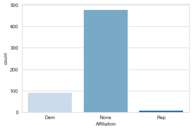
Looks like the results are overall relatively neutral, but still leaning towards Democratic Affiliation, it will be good to keep this in mind. Let’s see if sorting by the Population hue gives me any further insight into the data.In [11]:
sns.set_style('whitegrid')
sns.countplot('Affiliation',data=poll_df,hue='Population')
Out[11]:
<matplotlib.axes._subplots.AxesSubplot at 0x13c217214a8>
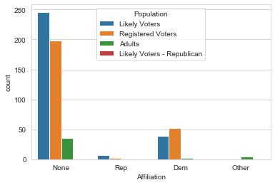
Looks like I have a strong showing of likely voters and Registered Voters, so the poll data should hopefully be a good reflection on the populations polled. Let’s take another quick overview of the DataFrame.In [12]:
poll_df.head()
Out[12]:
| Pollster | Start Date | End Date | Entry Date/Time (ET) | Number of Observations | Population | Mode | Obama | Romney | Undecided | Other | Pollster URL | Source URL | Partisan | Affiliation | Question Text | Question Iteration | |
|---|---|---|---|---|---|---|---|---|---|---|---|---|---|---|---|---|---|
| 0 | Politico/GWU/Battleground | 2012-11-04 | 2012-11-05 | 2012-11-06T08:40:26Z | 1000.0 | Likely Voters | Live Phone | 47.0 | 47.0 | 6.0 | NaN | http://elections.huffingtonpost.com/pollster/p… | http://www.politico.com/news/stories/1112/8338… | Nonpartisan | None | NaN | 1 |
| 1 | YouGov/Economist | 2012-11-03 | 2012-11-05 | 2012-11-26T15:31:23Z | 740.0 | Likely Voters | Internet | 49.0 | 47.0 | 3.0 | NaN | http://elections.huffingtonpost.com/pollster/p… | http://cdn.yougov.com/cumulus_uploads/document… | Nonpartisan | None | NaN | 1 |
| 2 | Gravis Marketing | 2012-11-03 | 2012-11-05 | 2012-11-06T09:22:02Z | 872.0 | Likely Voters | Automated Phone | 48.0 | 48.0 | 4.0 | NaN | http://elections.huffingtonpost.com/pollster/p… | http://www.gravispolls.com/2012/11/gravis-mark… | Nonpartisan | None | NaN | 1 |
| 3 | IBD/TIPP | 2012-11-03 | 2012-11-05 | 2012-11-06T08:51:48Z | 712.0 | Likely Voters | Live Phone | 50.0 | 49.0 | NaN | 1.0 | http://elections.huffingtonpost.com/pollster/p… | http://news.investors.com/special-report/50841… | Nonpartisan | None | NaN | 1 |
| 4 | Rasmussen | 2012-11-03 | 2012-11-05 | 2012-11-06T08:47:50Z | 1500.0 | Likely Voters | Automated Phone | 48.0 | 49.0 | NaN | NaN | http://elections.huffingtonpost.com/pollster/p… | http://www.rasmussenreports.com/public_content… | Nonpartisan | None | NaN | 1 |
Let’s go ahead and take a look at the averages for Obama, Romney, and the polled people who remained undecided.In [13]:
avg = pd.DataFrame(poll_df.mean())

#Remove excess header titles
avg.drop('Other',axis=0,inplace=True)
avg.drop('Question Text',axis=0,inplace=True)
avg.drop('Question Iteration',axis=0,inplace=True)

#avg.drop('Number of Observations',axis=0,inplace=True)
In [14]:
avg.head()
Out[14]:
| 0 | |
|---|---|
| Number of Observations | 1296.679078 |
| Obama | 46.805461 |
| Romney | 44.614334 |
| Undecided | 6.550827 |
In [15]:
std = pd.DataFrame(poll_df.std())

#Remove excess header titles
std.drop('Number of Observations',axis=0,inplace=True)
std.drop('Other',axis=0,inplace=True)
std.drop('Question Text',axis=0,inplace=True)
std.drop('Question Iteration',axis=0,inplace=True)
In [16]:
std.head()
Out[16]:
| 0 | |
|---|---|
| Obama | 2.422058 |
| Romney | 2.906180 |
| Undecided | 3.701754 |
In [17]:
avg.plot(yerr=std,kind='bar',legend=False)
Out[17]:
<matplotlib.axes._subplots.AxesSubplot at 0x13c21806400>
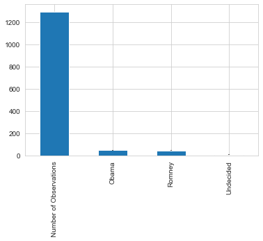
Interesting to see how close these polls seem to be, especially considering the undecided factor. Let’s take a look at the numbers.In [18]:
poll_avg = pd.concat([avg,std],sort=True,axis=1)
In [19]:
poll_avg.columns = ['Average','STD']
In [20]:
poll_avg
Out[20]:
| Average | STD | |
|---|---|---|
| Number of Observations | 1296.679078 | NaN |
| Obama | 46.805461 | 2.422058 |
| Romney | 44.614334 | 2.906180 |
| Undecided | 6.550827 | 3.701754 |
Looks like the polls indicate it as a fairly close race, but what about the undecided voters? Most of them will likely vote for one of the candidates once the election occurs. If I assume I split the undecided evenly between the two candidates the observed difference should be an unbiased estimate of the final difference.In [21]:
poll_df.head()
Out[21]:
| Pollster | Start Date | End Date | Entry Date/Time (ET) | Number of Observations | Population | Mode | Obama | Romney | Undecided | Other | Pollster URL | Source URL | Partisan | Affiliation | Question Text | Question Iteration | |
|---|---|---|---|---|---|---|---|---|---|---|---|---|---|---|---|---|---|
| 0 | Politico/GWU/Battleground | 2012-11-04 | 2012-11-05 | 2012-11-06T08:40:26Z | 1000.0 | Likely Voters | Live Phone | 47.0 | 47.0 | 6.0 | NaN | http://elections.huffingtonpost.com/pollster/p… | http://www.politico.com/news/stories/1112/8338… | Nonpartisan | None | NaN | 1 |
| 1 | YouGov/Economist | 2012-11-03 | 2012-11-05 | 2012-11-26T15:31:23Z | 740.0 | Likely Voters | Internet | 49.0 | 47.0 | 3.0 | NaN | http://elections.huffingtonpost.com/pollster/p… | http://cdn.yougov.com/cumulus_uploads/document… | Nonpartisan | None | NaN | 1 |
| 2 | Gravis Marketing | 2012-11-03 | 2012-11-05 | 2012-11-06T09:22:02Z | 872.0 | Likely Voters | Automated Phone | 48.0 | 48.0 | 4.0 | NaN | http://elections.huffingtonpost.com/pollster/p… | http://www.gravispolls.com/2012/11/gravis-mark… | Nonpartisan | None | NaN | 1 |
| 3 | IBD/TIPP | 2012-11-03 | 2012-11-05 | 2012-11-06T08:51:48Z | 712.0 | Likely Voters | Live Phone | 50.0 | 49.0 | NaN | 1.0 | http://elections.huffingtonpost.com/pollster/p… | http://news.investors.com/special-report/50841… | Nonpartisan | None | NaN | 1 |
| 4 | Rasmussen | 2012-11-03 | 2012-11-05 | 2012-11-06T08:47:50Z | 1500.0 | Likely Voters | Automated Phone | 48.0 | 49.0 | NaN | NaN | http://elections.huffingtonpost.com/pollster/p… | http://www.rasmussenreports.com/public_content… | Nonpartisan | None | NaN | 1 |
If I wanted to, I could also do a quick (and messy) time series analysis of the voter sentiment by plotting Obama/Romney favor versus the Poll End Dates. Let’s take a look at how I could quickly do tht in pandas.
Note: The time is in reverse chronological order. Also keep in mind the multiple polls per end date.In [22]:
poll_df.plot(x='End Date',y=['Obama','Romney','Undecided'],linestyle='',marker='o')
Out[22]:
<matplotlib.axes._subplots.AxesSubplot at 0x13c21873fd0>
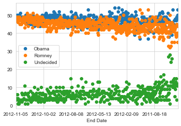
While this may give me a quick idea, I can try creating a new DataFrame or editing poll_df to make a better visualization of the above idea!
To lead you along the right path for plotting, I’ll go ahead and answer another question related to plotting the sentiment versus time. Let’s go ahead and plot out the difference between Obama and Romney and how it changes as time moves along. From the last data project I used the datetime module to create timestamps, I’ll go ahead and use it now.In [23]:
from datetime import datetime
Now we’ll define a new column in our poll_df DataFrame to take into account the difference between Romney and Obama in the polls.In [24]:
poll_df['Difference'] = (poll_df.Obama - poll_df.Romney)/100

poll_df.head()
Out[24]:
| Pollster | Start Date | End Date | Entry Date/Time (ET) | Number of Observations | Population | Mode | Obama | Romney | Undecided | Other | Pollster URL | Source URL | Partisan | Affiliation | Question Text | Question Iteration | Difference | |
|---|---|---|---|---|---|---|---|---|---|---|---|---|---|---|---|---|---|---|
| 0 | Politico/GWU/Battleground | 2012-11-04 | 2012-11-05 | 2012-11-06T08:40:26Z | 1000.0 | Likely Voters | Live Phone | 47.0 | 47.0 | 6.0 | NaN | http://elections.huffingtonpost.com/pollster/p… | http://www.politico.com/news/stories/1112/8338… | Nonpartisan | None | NaN | 1 | 0.00 |
| 1 | YouGov/Economist | 2012-11-03 | 2012-11-05 | 2012-11-26T15:31:23Z | 740.0 | Likely Voters | Internet | 49.0 | 47.0 | 3.0 | NaN | http://elections.huffingtonpost.com/pollster/p… | http://cdn.yougov.com/cumulus_uploads/document… | Nonpartisan | None | NaN | 1 | 0.02 |
| 2 | Gravis Marketing | 2012-11-03 | 2012-11-05 | 2012-11-06T09:22:02Z | 872.0 | Likely Voters | Automated Phone | 48.0 | 48.0 | 4.0 | NaN | http://elections.huffingtonpost.com/pollster/p… | http://www.gravispolls.com/2012/11/gravis-mark… | Nonpartisan | None | NaN | 1 | 0.00 |
| 3 | IBD/TIPP | 2012-11-03 | 2012-11-05 | 2012-11-06T08:51:48Z | 712.0 | Likely Voters | Live Phone | 50.0 | 49.0 | NaN | 1.0 | http://elections.huffingtonpost.com/pollster/p… | http://news.investors.com/special-report/50841… | Nonpartisan | None | NaN | 1 | 0.01 |
| 4 | Rasmussen | 2012-11-03 | 2012-11-05 | 2012-11-06T08:47:50Z | 1500.0 | Likely Voters | Automated Phone | 48.0 | 49.0 | NaN | NaN | http://elections.huffingtonpost.com/pollster/p… | http://www.rasmussenreports.com/public_content… | Nonpartisan | None | NaN | 1 | -0.01 |
Great! Keep in mind that the Difference column is Obama minus Romney, thus a positive difference indicates a leaning towards Obama in the polls.
Now let’s go ahead and see if we can visualize how this sentiment in difference changes over time. We will start by using groupby to group the polls by their start data and then sorting it by that Start Date.
In [25]:
poll_df = poll_df.groupby(['Start Date'],as_index=False).mean()

poll_df.head()
Out[25]:
| Start Date | Number of Observations | Obama | Romney | Undecided | Other | Question Text | Question Iteration | Difference | |
|---|---|---|---|---|---|---|---|---|---|
| 0 | 2009-03-13 | 1403.0 | 44.0 | 44.0 | 12.0 | NaN | NaN | 1 | 0.00 |
| 1 | 2009-04-17 | 686.0 | 50.0 | 39.0 | 11.0 | NaN | NaN | 1 | 0.11 |
| 2 | 2009-05-14 | 1000.0 | 53.0 | 35.0 | 12.0 | NaN | NaN | 1 | 0.18 |
| 3 | 2009-06-12 | 638.0 | 48.0 | 40.0 | 12.0 | NaN | NaN | 1 | 0.08 |
| 4 | 2009-07-15 | 577.0 | 49.0 | 40.0 | 11.0 | NaN | NaN | 1 | 0.09 |
Next, plotting the Differencce versus time should be pretty simple.In [26]:
#Check if dtype is object
poll_df.dtypes
Out[26]:
Start Date                 object
Number of Observations    float64
Obama                     float64
Romney                    float64
Undecided                 float64
Other                     float64
Question Text             float64
Question Iteration          int64
Difference                float64
dtype: object
In [27]:
#Tests datetime function
pd.to_datetime(poll_df['Start Date'])
Out[27]:
0     2009-03-13
1     2009-04-17
2     2009-05-14
3     2009-06-12
4     2009-07-15
5     2009-07-18
6     2009-08-14
7     2009-09-21
8     2009-10-16
9     2009-11-13
10    2009-11-24
11    2009-12-04
12    2010-01-12
13    2010-01-18
14    2010-02-13
15    2010-03-12
16    2010-03-17
17    2010-04-09
18    2010-05-07
19    2010-06-04
20    2010-07-09
21    2010-07-16
22    2010-08-06
23    2010-09-10
24    2010-09-28
25    2010-10-27
26    2010-11-08
27    2010-11-19
28    2010-12-03
29    2010-12-09
         ...
327   2012-10-04
328   2012-10-05
329   2012-10-06
330   2012-10-07
331   2012-10-08
332   2012-10-10
333   2012-10-11
334   2012-10-12
335   2012-10-13
336   2012-10-14
337   2012-10-15
338   2012-10-16
339   2012-10-17
340   2012-10-18
341   2012-10-19
342   2012-10-20
343   2012-10-22
344   2012-10-23
345   2012-10-24
346   2012-10-25
347   2012-10-26
348   2012-10-27
349   2012-10-28
350   2012-10-29
351   2012-10-30
352   2012-10-31
353   2012-11-01
354   2012-11-02
355   2012-11-03
356   2012-11-04
Name: Start Date, Length: 357, dtype: datetime64[ns]
In [28]:
#Check if dtype is converted to datetime to display dates under graphs
poll_df.dtypes
Out[28]:
Start Date                 object
Number of Observations    float64
Obama                     float64
Romney                    float64
Undecided                 float64
Other                     float64
Question Text             float64
Question Iteration          int64
Difference                float64
dtype: object
In [29]:
#Convert 'Start Date' object to datetime to display dates
poll_df['Start Date'] = pd.to_datetime(poll_df['Start Date'])
In [30]:
poll_df.dtypes
Out[30]:
Start Date                datetime64[ns]
Number of Observations           float64
Obama                            float64
Romney                           float64
Undecided                        float64
Other                            float64
Question Text                    float64
Question Iteration                 int64
Difference                       float64
dtype: object
In [31]:
# Plotting the difference in polls between Obama and Romney
fig = poll_df.plot('Start Date', 'Difference',figsize=(16,4),marker='o',linestyle='-',color='purple')
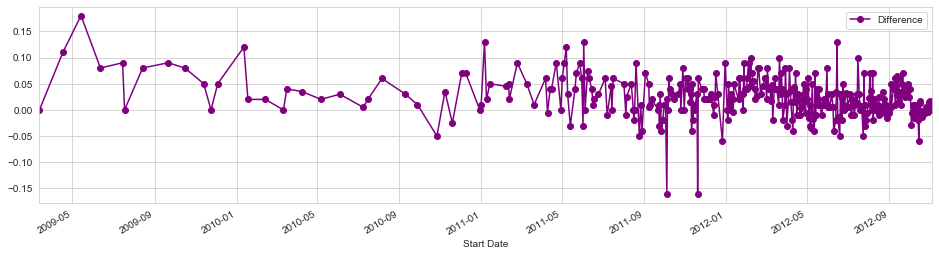
I can plot marker lines on the dates of the debates to see if there is any general insight to the poll results.
The debate dates were 10/3, 10/11, and 10/22. Next, I’ll plot some lines as markers and then zoom in on the month of October.
I need to find where to set the x limits for the figure by finding out where the index for the month of October in 2012 is. I’ll use a simple for loop to find that row. However, the string format of the date makes this difficult to do without using a lambda expression or a map.
In [32]:
pd.to_numeric(poll_df['Difference'])
Out[32]:
0      0.000000
1      0.110000
2      0.180000
3      0.080000
4      0.090000
5      0.000000
6      0.080000
7      0.090000
8      0.080000
9      0.050000
10     0.000000
11     0.050000
12     0.120000
13     0.020000
14     0.020000
15     0.000000
16     0.040000
17     0.035000
18     0.020000
19     0.030000
20     0.005000
21     0.020000
22     0.060000
23     0.030000
24     0.010000
25    -0.050000
26     0.035000
27    -0.025000
28     0.070000
29     0.070000
         ...
327   -0.028333
328   -0.005000
329    0.010000
330   -0.003333
331   -0.015000
332    0.010000
333    0.005000
334   -0.005000
335   -0.005000
336   -0.020000
337   -0.060000
338    0.016667
339    0.013333
340   -0.001667
341   -0.013333
342   -0.003333
343   -0.003333
344   -0.005000
345   -0.005000
346    0.006000
347    0.000000
348    0.000000
349   -0.003333
350    0.000000
351    0.015000
352    0.015000
353    0.017500
354    0.007500
355    0.005000
356    0.000000
Name: Difference, Length: 357, dtype: float64
In [33]:
poll_df = pd.read_csv(url, parse_dates=['Start Date'])

df = poll_df[poll_df['Start Date'].dt.strftime('%Y-%m') == '2012-10']

print(df['Start Date'].dtype)
datetime64[ns]
In [34]:
print(df.head())
                Pollster Start Date    End Date  Entry Date/Time (ET)  \
18                YouGov 2012-10-31  2012-11-03  2012-11-04T16:24:50Z
19                   Pew 2012-10-31  2012-11-03  2012-11-04T15:46:59Z
21             Rasmussen 2012-10-31  2012-11-02  2012-11-03T10:54:09Z
22     Purple Strategies 2012-10-31  2012-11-01  2012-11-02T12:31:41Z
23  JZ Analytics/Newsmax 2012-10-30  2012-11-01  2012-11-02T22:57:27Z

    Number of Observations     Population             Mode  Obama  Romney  \
18                 36472.0  Likely Voters         Internet   49.0    47.0
19                  2709.0  Likely Voters       Live Phone   48.0    45.0
21                  1500.0  Likely Voters  Automated Phone   48.0    48.0
22                  1000.0  Likely Voters       IVR/Online   47.0    46.0
23                  1030.0  Likely Voters         Internet   48.0    46.0

    Undecided  Other                                       Pollster URL  \
18        3.0    NaN  http://elections.huffingtonpost.com/pollster/p...
19        NaN    3.0  http://elections.huffingtonpost.com/pollster/p...
21        2.0    1.0  http://elections.huffingtonpost.com/pollster/p...
22        7.0    NaN  http://elections.huffingtonpost.com/pollster/p...
23        6.0    NaN  http://elections.huffingtonpost.com/pollster/p...

                                           Source URL     Partisan  \
18  http://cdn.yougov.com/r/1/ygTabs_november_like...  Nonpartisan
19  http://www.people-press.org/2012/11/04/obama-g...  Nonpartisan
21  http://www.rasmussenreports.com/public_content...  Nonpartisan
22  http://www.purplestrategies.com/wp-content/upl...  Nonpartisan
23                        http://www.jzanalytics.com/      Sponsor

   Affiliation  Question Text  Question Iteration
18        None            NaN                   1
19        None            NaN                   1
21        None            NaN                   1
22        None            NaN                   1
23         Rep            NaN                   1
In [35]:
# Input data files are available in the "../input/" directory.
# For example, running this (by clicking run or pressing Shift+Enter) will list the files in the input directory
# Any results you write to the current directory are saved as output.
from subprocess import check_output
poll_df = pd.read_csv(url)
poll_df.info()

#get a preview of the dataset
poll_df.head()
<class 'pandas.core.frame.DataFrame'>
RangeIndex: 586 entries, 0 to 585
Data columns (total 17 columns):
Pollster                  586 non-null object
Start Date                586 non-null object
End Date                  586 non-null object
Entry Date/Time (ET)      586 non-null object
Number of Observations    564 non-null float64
Population                586 non-null object
Mode                      586 non-null object
Obama                     586 non-null float64
Romney                    586 non-null float64
Undecided                 423 non-null float64
Other                     202 non-null float64
Pollster URL              586 non-null object
Source URL                584 non-null object
Partisan                  586 non-null object
Affiliation               586 non-null object
Question Text             0 non-null float64
Question Iteration        586 non-null int64
dtypes: float64(6), int64(1), object(10)
memory usage: 77.9+ KB
Out[35]:
| Pollster | Start Date | End Date | Entry Date/Time (ET) | Number of Observations | Population | Mode | Obama | Romney | Undecided | Other | Pollster URL | Source URL | Partisan | Affiliation | Question Text | Question Iteration | |
|---|---|---|---|---|---|---|---|---|---|---|---|---|---|---|---|---|---|
| 0 | Politico/GWU/Battleground | 2012-11-04 | 2012-11-05 | 2012-11-06T08:40:26Z | 1000.0 | Likely Voters | Live Phone | 47.0 | 47.0 | 6.0 | NaN | http://elections.huffingtonpost.com/pollster/p… | http://www.politico.com/news/stories/1112/8338… | Nonpartisan | None | NaN | 1 |
| 1 | YouGov/Economist | 2012-11-03 | 2012-11-05 | 2012-11-26T15:31:23Z | 740.0 | Likely Voters | Internet | 49.0 | 47.0 | 3.0 | NaN | http://elections.huffingtonpost.com/pollster/p… | http://cdn.yougov.com/cumulus_uploads/document… | Nonpartisan | None | NaN | 1 |
| 2 | Gravis Marketing | 2012-11-03 | 2012-11-05 | 2012-11-06T09:22:02Z | 872.0 | Likely Voters | Automated Phone | 48.0 | 48.0 | 4.0 | NaN | http://elections.huffingtonpost.com/pollster/p… | http://www.gravispolls.com/2012/11/gravis-mark… | Nonpartisan | None | NaN | 1 |
| 3 | IBD/TIPP | 2012-11-03 | 2012-11-05 | 2012-11-06T08:51:48Z | 712.0 | Likely Voters | Live Phone | 50.0 | 49.0 | NaN | 1.0 | http://elections.huffingtonpost.com/pollster/p… | http://news.investors.com/special-report/50841… | Nonpartisan | None | NaN | 1 |
| 4 | Rasmussen | 2012-11-03 | 2012-11-05 | 2012-11-06T08:47:50Z | 1500.0 | Likely Voters | Automated Phone | 48.0 | 49.0 | NaN | NaN | http://elections.huffingtonpost.com/pollster/p… | http://www.rasmussenreports.com/public_content… | Nonpartisan | None | NaN | 1 |
In [36]:
from datetime import datetime
poll_df['Difference'] = (poll_df.Obama - poll_df.Romney)/100
group and obtain averages for particular start dates, keep index as is
poll_df = poll_df.groupby([‘Start Date’], as_index=False).mean() poll_df.head()In [37]:
poll_df.plot('Start Date','Difference',figsize=(16,4),marker='o',linestyle='-',color='purple',xlim=(325,352))

# Oct 3rd
plt.axvline(x=325+2,linewidth=4,color='grey')
# Oct 11th
plt.axvline(x=325+10,linewidth=4,color='grey')
#Oct 22nd
plt.axvline(x=325+21,linewidth=4,color='grey')
Out[37]:
<matplotlib.lines.Line2D at 0x13c21aeab38>
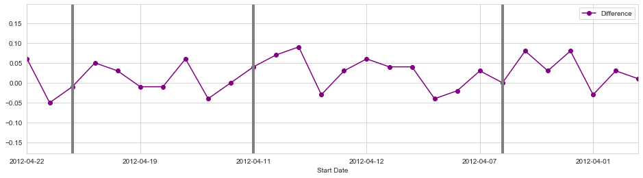
Interestingly, thse polls reflect a dip for Obama after the second debate against Romney, even though he performed much worse in the polls against Romney during the first debate.
It is crucial to remeber how geographical location can affect the value of a poll in predicting the outcomes of a national election.
Donor Data Set
Next, I am going to take a look at a data set consisting of information on donations to the federal campaign.
This should be a bigger set of data compared to the first and the questions are as follows:
1.) How much was donated and what was the average donation? 2.) How did the donations differ between candidates? 3.) How did the donations differ between Democrats and Republicans? 4.) What were the demographics of the donors? 5.) Is there a pattern to donation amounts?In [38]:
donor_df = pd.read_csv('Election_Donor_Data.csv',low_memory=False )
donor_df.info()
donor_df.head()
<class 'pandas.core.frame.DataFrame'>
RangeIndex: 1001731 entries, 0 to 1001730
Data columns (total 16 columns):
cmte_id              1001731 non-null object
cand_id              1001731 non-null object
cand_nm              1001731 non-null object
contbr_nm            1001731 non-null object
contbr_city          1001712 non-null object
contbr_st            1001727 non-null object
contbr_zip           1001620 non-null object
contbr_employer      988002 non-null object
contbr_occupation    993301 non-null object
contb_receipt_amt    1001731 non-null float64
contb_receipt_dt     1001731 non-null object
receipt_desc         14166 non-null object
memo_cd              92482 non-null object
memo_text            97770 non-null object
form_tp              1001731 non-null object
file_num             1001731 non-null int64
dtypes: float64(1), int64(1), object(14)
memory usage: 122.3+ MB
Out[38]:
| cmte_id | cand_id | cand_nm | contbr_nm | contbr_city | contbr_st | contbr_zip | contbr_employer | contbr_occupation | contb_receipt_amt | contb_receipt_dt | receipt_desc | memo_cd | memo_text | form_tp | file_num | |
|---|---|---|---|---|---|---|---|---|---|---|---|---|---|---|---|---|
| 0 | C00410118 | P20002978 | Bachmann, Michelle | HARVEY, WILLIAM | MOBILE | AL | 366010290 | RETIRED | RETIRED | 250.0 | 20-JUN-11 | NaN | NaN | NaN | SA17A | 736166 |
| 1 | C00410118 | P20002978 | Bachmann, Michelle | HARVEY, WILLIAM | MOBILE | AL | 366010290 | RETIRED | RETIRED | 50.0 | 23-JUN-11 | NaN | NaN | NaN | SA17A | 736166 |
| 2 | C00410118 | P20002978 | Bachmann, Michelle | SMITH, LANIER | LANETT | AL | 368633403 | INFORMATION REQUESTED | INFORMATION REQUESTED | 250.0 | 05-JUL-11 | NaN | NaN | NaN | SA17A | 749073 |
| 3 | C00410118 | P20002978 | Bachmann, Michelle | BLEVINS, DARONDA | PIGGOTT | AR | 724548253 | NONE | RETIRED | 250.0 | 01-AUG-11 | NaN | NaN | NaN | SA17A | 749073 |
| 4 | C00410118 | P20002978 | Bachmann, Michelle | WARDENBURG, HAROLD | HOT SPRINGS NATION | AR | 719016467 | NONE | RETIRED | 300.0 | 20-JUN-11 | NaN | NaN | NaN | SA17A | 736166 |
It will be useful to catch a quick glimpse of the donation amounts, and the average donation amount. Below is a break down of the data.In [39]:
#find the most common donation amounts
donor_df['contb_receipt_amt'].value_counts()
Out[39]:
 100.00     178188
 50.00      137584
 25.00      110345
 250.00      91182
 500.00      57984
 2500.00     49005
 35.00       37237
 1000.00     36494
 10.00       33986
 200.00      27813
 20.00       17565
 15.00       16163
 150.00      14600
 75.00       13647
 201.20      11718
 30.00       11381
 300.00      11204
 20.12        9897
 5.00         9024
 40.00        5007
 2000.00      4128
 55.00        3760
 1500.00      3705
 3.00         3383
 60.00        3084
 400.00       3066
-2500.00      2727
 110.00       2554
 125.00       2520
 19.00        2474
             ...
 174.80          1
 7.27            1
 1219.00         1
 1884.88         1
 162.25          1
 218.31          1
 78.62           1
 203.16          1
 53.11           1
 499.66          1
 19.53           1
 188.60          1
 47.10           1
 19.85           1
 28.83           1
 202.59          1
-5500.00         1
 9.25            1
 202.66          1
 1205.00         1
 80.73           1
 115.07          1
 213.69          1
 70.76           1
 144.13          1
 97.15           1
 122.32          1
 188.65          1
 122.40          1
 132.12          1
Name: contb_receipt_amt, Length: 8079, dtype: int64
From this data we can see there are 8079 different amounts! Which is a pretty big variation. Next, I am going to look at the average and the standard donation amounts.In [40]:
#figure out average donation and error
don_mean = donor_df['contb_receipt_amt'].mean()

don_std = donor_df['contb_receipt_amt'].std()

print("The average donation was %.2f with a std %.2f" %(don_mean,don_std))
The average donation was 298.24 with a std 3749.67
The results show a huge standard deviation! I will investigate to see if there are any large donations or other factors skewing the distribution of the donations.
In [41]:
top_donor = donor_df['contb_receipt_amt'].copy()

top_donor.sort_values()

top_donor
Out[41]:
0           250.0
1            50.0
2           250.0
3           250.0
4           300.0
5           500.0
6           250.0
7           250.0
8           250.0
9           250.0
10          250.0
11          500.0
12          250.0
13          250.0
14          250.0
15          300.0
16          500.0
17         1000.0
18          250.0
19          300.0
20          500.0
21          250.0
22         2500.0
23         2500.0
24          150.0
25          200.0
26          100.0
27          250.0
28          500.0
29          250.0
            ...
1001701    2500.0
1001702    2500.0
1001703   -2500.0
1001704   -2500.0
1001705    1000.0
1001706    2500.0
1001707   -2500.0
1001708    2500.0
1001709   -2500.0
1001710   -2500.0
1001711    1000.0
1001712    2500.0
1001713    2500.0
1001714     250.0
1001715     250.0
1001716    1000.0
1001717     100.0
1001718    2500.0
1001719    2500.0
1001720     100.0
1001721     250.0
1001722     100.0
1001723     100.0
1001724     500.0
1001725    2500.0
1001726    5000.0
1001727    2500.0
1001728     500.0
1001729     500.0
1001730    2500.0
Name: contb_receipt_amt, Length: 1001731, dtype: float64
So, I have some negative values and some huge donation amounts. The negative values seem to be due to the FEC recording refunds as well as donations. I will now take a look at the positive contribution amountsIn [42]:
#negative values mean that the donations were refunded so we don't want to take those into consideration
top_donor = top_donor[top_donor > 0]

top_donor.sort_values()
Out[42]:
335573          0.01
335407          0.01
335352          0.01
324596          0.01
329896          0.01
318560          0.01
335100          0.01
318670          0.01
329984          0.01
335087          0.01
335033          0.01
330220          0.01
330222          0.01
324283          0.01
324170          0.01
334913          0.01
334899          0.01
323823          0.01
324778          0.01
323822          0.01
324838          0.01
324876          0.01
336020          0.01
317634          0.01
325344          0.01
335767          0.01
317753          0.01
325153          0.01
325151          0.01
350626          0.01
             ...
710177      10000.00
709608      10000.00
99829       10000.00
711167      10000.00
993178      10000.00
710198      10000.00
708928      10000.00
708022      10000.00
709739      10000.00
709859      10000.00
709813      10000.00
708919      10000.00
708138      10000.00
876244      10000.00
91145       10000.00
708898      10000.00
710730      10000.00
709268      10000.00
65131       12700.00
834301      25000.00
823345      25000.00
217891      25800.00
114754      33300.00
257270     451726.00
335187     512710.91
319478     526246.17
344419    1511192.17
344539    1679114.65
326651    1944042.43
325136    2014490.51
Name: contb_receipt_amt, Length: 991475, dtype: float64
In [43]:
#this is to find the most common donations
top_donor.value_counts().head(10)
Out[43]:
100.0     178188
50.0      137584
25.0      110345
250.0      91182
500.0      57984
2500.0     49005
35.0       37237
1000.0     36494
10.0       33986
200.0      27813
Name: contb_receipt_amt, dtype: int64
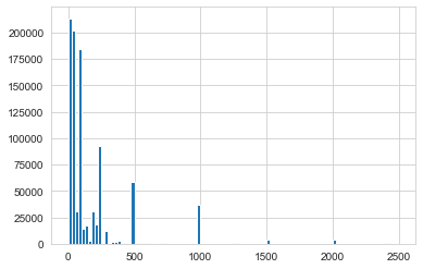
Here I can see that the top 10 most common donations ranged from 10 to 2500 dollars. A quick question I could verify is if donations are usually made in round number amounts? (e.g. 10,20,50,100,500 etc.) We can quickly visualize this by making a histogram and checking for peaks at those values. I can try this for the most common amounts, up to 2500 dollars.In [44]:
com_don = top_donor[top_donor < 2500]
com_don.hist(bins=100)
Out[44]:
<matplotlib.axes._subplots.AxesSubplot at 0x13c32961588>
Looks like our intuition was right, since we spikes at the round numbers. I can dig deeper into the data and see if I can seperate donations by Party, in order to do this I’ll have to figure out a way of creating a new ‘Party’ column. I can do this by starting with the candidates and their affliliation. Time to get a list of candidates!In [45]:
candidates = donor_df.cand_nm.unique()

candidates
Out[45]:
array(['Bachmann, Michelle', 'Romney, Mitt', 'Obama, Barack',
       "Roemer, Charles E. 'Buddy' III", 'Pawlenty, Timothy',
       'Johnson, Gary Earl', 'Paul, Ron', 'Santorum, Rick',
       'Cain, Herman', 'Gingrich, Newt', 'McCotter, Thaddeus G',
       'Huntsman, Jon', 'Perry, Rick'], dtype=object)
I’ll go ahead and seperate Obama from the Republican Candidates by adding a Party Affiliation column. I can do this by using map along a dictionary of party affiliations. Lecture 36 has a review of this topic.In [46]:
#register of party affiliation

party_map = {'Bachmann, Michelle': "Republican",
             'Romney, Mitt': "Republican",
             'Obama, Barack': "Democrat",
             "Roemer, Charles E. 'Buddy' III": "Republican",
             'Pawlenty, Timothy': "Republican",
             'Johnson, Gary Earl': "Republican",
             'Paul, Ron': "Republican",
             'Santorum, Rick': "Republican",
             'Cain, Herman': "Republican",
             'Gingrich, Newt': "Republican",
             'McCotter, Thaddeus G': "Republican",
             'Huntsman, Jon': "Republican",
             'Perry, Rick': "Republican"}

#mapping the candidates and their affiliation
donor_df['Party'] = donor_df.cand_nm.map(party_map)
This operation can also be done manually using a for loop, however this operation would be much slower than using the map method. Next, it’s time to look at our DataFrame and also make sure I clear refunds from the contribution amounts.In [47]:
#clear refunds
donor_df = donor_df[donor_df.contb_receipt_amt >0]

#preview DataFrame
donor_df.head()
Out[47]:
| cmte_id | cand_id | cand_nm | contbr_nm | contbr_city | contbr_st | contbr_zip | contbr_employer | contbr_occupation | contb_receipt_amt | contb_receipt_dt | receipt_desc | memo_cd | memo_text | form_tp | file_num | Party | |
|---|---|---|---|---|---|---|---|---|---|---|---|---|---|---|---|---|---|
| 0 | C00410118 | P20002978 | Bachmann, Michelle | HARVEY, WILLIAM | MOBILE | AL | 366010290 | RETIRED | RETIRED | 250.0 | 20-JUN-11 | NaN | NaN | NaN | SA17A | 736166 | Republican |
| 1 | C00410118 | P20002978 | Bachmann, Michelle | HARVEY, WILLIAM | MOBILE | AL | 366010290 | RETIRED | RETIRED | 50.0 | 23-JUN-11 | NaN | NaN | NaN | SA17A | 736166 | Republican |
| 2 | C00410118 | P20002978 | Bachmann, Michelle | SMITH, LANIER | LANETT | AL | 368633403 | INFORMATION REQUESTED | INFORMATION REQUESTED | 250.0 | 05-JUL-11 | NaN | NaN | NaN | SA17A | 749073 | Republican |
| 3 | C00410118 | P20002978 | Bachmann, Michelle | BLEVINS, DARONDA | PIGGOTT | AR | 724548253 | NONE | RETIRED | 250.0 | 01-AUG-11 | NaN | NaN | NaN | SA17A | 749073 | Republican |
| 4 | C00410118 | P20002978 | Bachmann, Michelle | WARDENBURG, HAROLD | HOT SPRINGS NATION | AR | 719016467 | NONE | RETIRED | 300.0 | 20-JUN-11 | NaN | NaN | NaN | SA17A | 736166 | Republican |
I’ll start by aggregating the data by candidate. I’ll then take a quick look a the total amounts received by each candidate. But first, I will look a the total number of donations and then at the total amount.In [48]:
donor_df = donor_df[donor_df.contb_receipt_amt >0]
#total number of contributions made to each candidate
donor_df.groupby('cand_nm')['contb_receipt_amt'].count()
Out[48]:
cand_nm
Bachmann, Michelle                 13082
Cain, Herman                       20052
Gingrich, Newt                     46883
Huntsman, Jon                       4066
Johnson, Gary Earl                  1234
McCotter, Thaddeus G                  73
Obama, Barack                     589127
Paul, Ron                         143161
Pawlenty, Timothy                   3844
Perry, Rick                        12709
Roemer, Charles E. 'Buddy' III      5844
Romney, Mitt                      105155
Santorum, Rick                     46245
Name: contb_receipt_amt, dtype: int64
Clearly Obama is the front-runner in number of people donating, which makes sense, since he is not competeing with any other democratic nominees. Time to take a look at the total dollar amounts.In [49]:
#total value of contributions
donor_df.groupby('cand_nm')['contb_receipt_amt'].sum()
Out[49]:
cand_nm
Bachmann, Michelle                2.711439e+06
Cain, Herman                      7.101082e+06
Gingrich, Newt                    1.283277e+07
Huntsman, Jon                     3.330373e+06
Johnson, Gary Earl                5.669616e+05
McCotter, Thaddeus G              3.903000e+04
Obama, Barack                     1.358774e+08
Paul, Ron                         2.100962e+07
Pawlenty, Timothy                 6.004819e+06
Perry, Rick                       2.030575e+07
Roemer, Charles E. 'Buddy' III    3.730099e+05
Romney, Mitt                      8.833591e+07
Santorum, Rick                    1.104316e+07
Name: contb_receipt_amt, dtype: float64
This list isn’t very readable, and an important aspect of data science is to clearly present information. It will be much better to just print out these values in a clean for loop.In [50]:
cand_amount = donor_df.groupby('cand_nm')['contb_receipt_amt'].sum()

#cleaning out the numbers
i = 0

for don in cand_amount:
    print('The candidate %s raise %.0f dollars' %(cand_amount.index[i],don))
    print('\n')
    i += 1
The candidate Bachmann, Michelle raise 2711439 dollars


The candidate Cain, Herman raise 7101082 dollars


The candidate Gingrich, Newt raise 12832770 dollars


The candidate Huntsman, Jon raise 3330373 dollars


The candidate Johnson, Gary Earl raise 566962 dollars


The candidate McCotter, Thaddeus G raise 39030 dollars


The candidate Obama, Barack raise 135877427 dollars


The candidate Paul, Ron raise 21009620 dollars


The candidate Pawlenty, Timothy raise 6004819 dollars


The candidate Perry, Rick raise 20305754 dollars


The candidate Roemer, Charles E. 'Buddy' III raise 373010 dollars


The candidate Romney, Mitt raise 88335908 dollars


The candidate Santorum, Rick raise 11043159 dollars
This is okay, but its hard to do a quick comparison just by reading this information. How about just a quick graphic presentation?In [51]:
#plot candidate's donation value
cand_amount.plot(kind='bar')
Out[51]:
<matplotlib.axes._subplots.AxesSubplot at 0x13c23064b70>
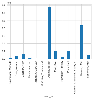
Now the comparison is very easy to see. Just like berfore, clearly Obama is the front-runner in donation amounts, which makes sense, since he is not competeing with any other democratic nominees. How about we just compare Democrat versus Republican donations?In [52]:
#As an individual candidate, Obama had the highest amount of donations
In [53]:
donor_df.groupby('Party')['contb_receipt_amt'].sum().plot(kind="bar")
Out[53]:
<matplotlib.axes._subplots.AxesSubplot at 0x13c230c4208>
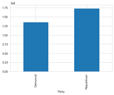
From these results, Obama couldn’t compete against all the republicans, but he certainly has the advantage of their funding being splintered across multiple candidates. Although Obama had the most donations as the only democratic candidate, his total donations did not exceed the total donations for the party. These donations were spread between multiple candidates
Finally to start closing out the project, let’s look at donations and who they came from (as far as occupation is concerned). I will start by grabing the occupation information from the dono_df DataFrame and then using pivot_table to make the index defined by the various occupations and then have the columns defined by the Party (Republican or Democrat). FInally I’ll also pass an aggregation function in the pivot table, in this case a simple sum function will add up all the comntributions by anyone with the same profession.In [54]:
occupation_df = donor_df.pivot_table('contb_receipt_amt', index='contbr_occupation', columns='Party',aggfunc='sum')
In [55]:
occupation_df.tail()
Out[55]:
| Party | Democrat | Republican |
|---|---|---|
| contbr_occupation | ||
| ZOOKEEPER | 35.0 | NaN |
| ZOOLOGIST | 400.0 | NaN |
| ZOOLOGY EDUCATION | 25.0 | NaN |
| \NONE\ | NaN | 250.0 |
| ~ | NaN | 75.0 |
Let’s see how big the DataFrame is.In [56]:
#check size
occupation_df.shape
Out[56]:
(45067, 2)
This is probably far too large to display effectively with a small, static visualization. What I could do is have a cut-off for total contribution amounts. Afterall, small donations of 20 dollars by one type of occupation won’t give us too much insight. So let’s set our cut off at 1 million dollars.In [57]:
# Set a cut off point at 1 milllion dollars of sum contributions
occupation_df = occupation_df[occupation_df.sum(1) > 1000000]
In [58]:
# Now let's check the size!
occupation_df.shape
Out[58]:
(31, 2)
This looks much more manageable! Now let’s visualize it.In [59]:
# Plot out with pandas
occupation_df.plot(kind='bar')
Out[59]:
<matplotlib.axes._subplots.AxesSubplot at 0x13c231400f0>
This is a bit hard to read, so let’s use kind = ‘barh’ (horizontal) to set the ocucpation on the y axis.In [60]:
occupation_df = occupation_df[occupation_df.sum(1) > 1000000]
occupation_df.plot(kind='barh',figsize=(14,12), cmap='seismic')
Out[60]:
<matplotlib.axes._subplots.AxesSubplot at 0x13c23281908>
It seems like there are some occupations that are either mislabeled or aren’t really occupations. Let’s get rid of: Information Requested occupations.In [61]:
occupation_df.drop(['INFORMATION REQUESTED PER BEST EFFORTS', 'INFORMATION REQUESTED'],axis=0,inplace = True)
In [62]:
occupation_df.loc['CEO'] = occupation_df.loc['CEO'] + occupation_df.loc['C.E.O.']
In [63]:
occupation_df.drop(['C.E.O.'], inplace = True)
Let’s view it again!In [64]:
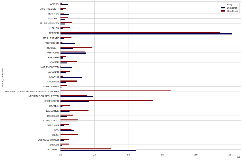
occupation_df = occupation_df[occupation_df.sum(1) > 1000000]
occupation_df.plot(kind='barh',figsize=(14,12), cmap='seismic')
Out[64]:
<matplotlib.axes._subplots.AxesSubplot at 0x13c246c96a0>
From this data it looks like CEO’s are a little more conservative leaning, this may be due to the tax philosphies of each party during the election.In [65]:
occupation_df.tail()
Out[65]:
| Party | Democrat | Republican |
|---|---|---|
| contbr_occupation | ||
| SELF-EMPLOYED | 672393.40 | 1640252.54 |
| STUDENT | 628099.75 | 1073283.65 |
| TEACHER | 1250969.15 | 463984.90 |
| VICE PRESIDENT | 325647.15 | 880162.26 |
| WRITER | 1084188.88 | 227928.41 |

